About

Friday, July 31, 2020

A Look at What’s New in Chrome DevTools in 2020

I’m excited to share some of the newer features in Chrome DevTools with you. There’s a brief introduction below, and then we’ll cover many of the new DevTools features. We’ll also look at what’s happening in some other browsers. I keep up with this stuff, as I create Dev Tips, the largest collection of DevTools tips you’ll find online! 

It’s a good idea to find out what’s changed in DevTools because it’s constantly evolving and new features are specifically designed to help and improve our development and debugging experience.

Let’s jump into the latest and greatest. While the public stable version of Chrome does have most of these features, I’m using Chrome Canary as I like to stay on the bleeding edge.

Lighthouse

Lighthouse is an open source tool for auditing web pages, typically around performance, SEO, accessibility and such. For a while now, Lighthouse has been bundled as part of DevTools meaning you can find it in a panel named… Lighthouse!

Screenshot of DevTools open on a CSS-Tricks page. The Lighthouse panel is open showing a best practices score of 100 out of 100.
Well done, Mr. Coyier. 🏆

I really like Lighthouse because it’s one of easiest parts of DevTools to use. Click “Generate report” and you immediately get human-readable notes for your webpage, such as:

Document uses legible font sizes 100% legible text

Or:

Avoid an excessive DOM size (1,189 elements)

Almost every single audit links to developer documentation that explains how the audit may fail, and what you can do to improve it.

The best way to get started with Lighthouse is to run audits on your own websites:

  1. Open up DevTools and navigate to the Lighthouse panel when you are on one of your sites
  2. Select the items you want to audit (Best practices is a good starting point)
  3. Click Generate report
  4. Click on any passed/failed audits to investigate the findings

Even though Lighthouse has been part of DevTools for a while now (since 2017!), it still deserves a significant mention because of the user-facing features it continues to ship, such as:

  • An audit that checks that anchor elements resolve to their URLs (Fun fact: I worked on this!)
  • An audit that checks whether the Largest Contentful Paint metic is fast enough
  • An audit to warn you of unused JavaScript

A better “Inspect Element”

This is a subtle and, in some ways, very small feature, but it can have profound effects on how we treat web accessibility.

Here’s how it works. When you use Inspect Element — what is arguably the most common use of DevTools — you now get a tooltip with additional information on accessibility.

Screenshot showing DevTools open on a CSS-Tricks page. An element is highlighted on the page and a tooltip with a white background is above it providing information on the element's color, font, contrast, name, role, and whether it is keyboard-focusable.
Accessibility is baked right in!

The reason I say this can have a profound impact is because DevTools has had accessibility features for quite some time now, but how many of us actually use them? Including this information on a commonly used feature like Inspect Element will gives it a lot more visibility and makes it a lot more accessible.

The tooltip includes:

  • the contrast ratio of the text (how well, or how poorly, does the foreground text contrast with the background color)
  • the text representation
  • the ARIA role
  • whether or not the inspected element is keyboard-focusable

To try this out, right-click (or Cmd + Shift + C) on an element and select Inspect to view it in DevTools.

I made a 14-minute video on Accessibility debugging with Chrome DevTools which covers some of this in more detail.

Emulate vision deficiencies

Exactly as it says on the tin, you can use Chrome DevTools to emulate vision impairments. For example, we can view a site through the lens of blurred vision.

Screenshot of DevTools open on a CSS-Tricks page. The Rendering panel is open and the blurred vision option is selected. The CSS-Tricks page is blurry and difficult to read.
That’s a challenge to read!

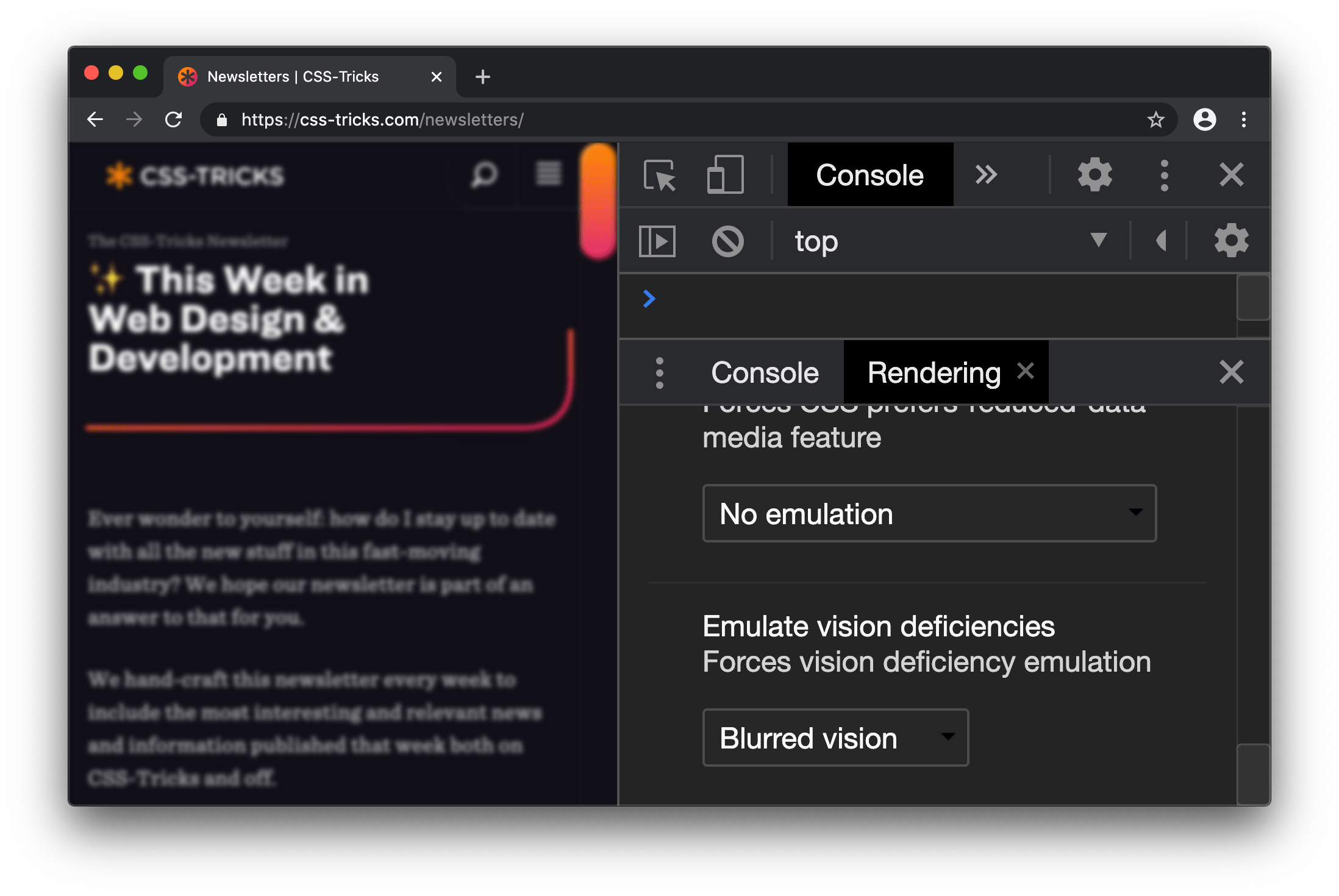
How can you do this in DevTools? Like this:

  1. Open DevTools (right click and “Inspect” or Cmd + Shift + C).
  2. Open the DevTools Command menu (Cmd + Shift + P on Mac, Ctrl + Shift + P on Windows).
  3. Select Show Rendering in the Command menu.
  4. Select a deficiency in the Rendering pane.

We used blurred vision as an example, but DevTools has other options, including: protanopia, deuteranopia, tritanopia, and achromatopsia.

Like with any tool of this nature, it’s designed to be a complement to our (hopefully) existing accessibility skills. In other words, it’s not instructional, but rather, influential on the designs and user experiences we create.

Here are a couple of extra resources on low vision accessibility and emulation:

Get timing on performance

The Performance Panel in DevTools can sometimes look like a confusing mish-mash of shapes and colors.

This update to it is great because it does a better job surfacing meaningful performance metrics.

Screenshot of DevTools with the Performance panel open. A chart showing the timeline of page rendering is above a row of Timings, including DCL, FP, FCP, L, and LCP. Below that is a summary that provides a time range for the selected timing.

What we want to look at are those extra timing rectangles shown in the “Timings” in the Performance Panel recording. This highlights:

  • DOMContentLoaded: The event which triggers when the initial HTML loads
  • First Paint: When the browser first paints pixels to the screen
  • First Contentful Paint: The point at which the browser draws content from the DOM which indicates to the user that content is loading
  • Onload: When the page and all of its resources have finished loading
  • Largest Contentful Paint: The largest image or text element, which is rendered in the viewport

As a bonus, if you find the Largest Contentful Paint event in a Performance Panel recording, you can click on it to get additional information.

Nice work, CSS-Tricks! The Largest Contentful Paint happens early on in the page load.

While there is a lot of golden information here, the “Related Node” is potentially the most useful item because it specifies exactly which element contributed to the LCP event.

To try this feature out:

  1. Open up DevTools and navigate to the Performance panel
  2. Click “Start profiling and reload page”
  3. Observe the timing metrics in the Timings section of a recording
  4. Click the individual metrics to see what additional information you get

Monitor performance

If you want to quickly get started using DevTools to analyze performance and you’ve already tried Lighthouse, then I recommend the Performance Monitor feature. This is sort of like having WebPageTest.org right at your fingertips with things like CPU usage.

Screenshot of DevTools with the Performance Monitor pane open. Four timeline charts are stacked vertically, starting with CPU Usage,followed by JavaScript Heap Size, DOM Nodes, and JavaScript Event Listeners.

Here’s how to access it:

  1. Open DevTools
  2. Open up the Command menu (Cmd + Shift + P on Mac, Ctrl + Shift + P on Windows)
  3. Select “Show performance monitor” from the Command menu
  4. Interact and navigate around the website
  5. Observe the results

The Performance Monitor can give you interesting metrics, however, unlike Lighthouse, it’s for you to figure out how to interpret them and take action. No suggestions are provided. It’s up to you to study that CPU usage chart and ask whether something like 90% is an acceptable level for your site (it probably isn’t).

The Performance Monitor has an interactive legend, where you can toggle metrics on and off, such as:

  • CPU usage
  • JS heap size
  • DOM Nodes
  • JS event listeners
  • Documents
  • Document Frames
  • Layouts / sec
  • Style recalcs / sec 

CSS overview and local overrides

CSS-Tricks has already covered these features, so go and check them out!

  • CSS Overview: A handy DevTools panel that gives a bunch of interesting stats on the CSS your page is using
  • Local Overrides:  A powerful feature that lets you override production websites with your local resources, so you can easily preview changes 

So, what about DevTool in other browsers?

I’m sure you noticed that I’ve been using Chrome throughout this article. It’s the browser I use personally. That said, it’s worth considering that:

  • Firefox DevTools is looking pretty great right now
  • With Microsoft Edge extending from Chromium, it too will benefit from these DevTools features
  • As evident on the Safari Technology Preview Release Notes (search for Web Inspector on that page), Safari DevTools has come a long way 

In other words, keep an eye out because this is a quickly evolving space!

Conclusion

We covered a lot in a short amount of space!

  • Lighthouse: A panel that provides  tips and suggestions for performance, accessibility, SEO and best practices.
  • Inspect Element: An enhancement to the Inspect Element feature that provides accessibility information to the Inspect Element tooltip
  • Emulate vision deficiencies: A feature in the Rendering Pane to view a page through the lens of low vision.
  • Performance Panel Timings: Additional metrics in the Performance panel recording, showing user-orientated stats, like Largest Contentful Paint
  • Performance Monitor – A real-time visualization of performance metrics for the current website, such as CPU usage and DOM size

Please check out my mailing list, Dev Tips, if you want to stay keep up with the latest updates and get over 200 web development tips! I also have a premium video course over at ModernDevTools.com. And, I tend to post loads of bonus web development resources on Twitter.


The post A Look at What’s New in Chrome DevTools in 2020 appeared first on CSS-Tricks.

You can support CSS-Tricks by being an MVP Supporter.


source https://css-tricks.com/whats-new-in-devtools-2020/

Spotting a Trend

There are tons of smokin’ hot websites out there, with an equal or greater number of talented designers and developers who make them. The web is awesome like that and encourages that sort of creativity.

Even so, it amazes me that certain traits find their way into things. I mean, it makes sense. Many of us use the same UI frameworks and take cues from sites we admire. But every once in a while, my eye starts catching wind of the zeitgeist and commonalities that come with it.

The latest one? Blobby shapes. It’s a fun flourish that adds a little panache, especially for flat designs that need a splash of color or an interesting focal point that leads the eye from one place to anther. I’m sure you’ve seen it. I spent one week collecting screenshots of websites I came across that use it. I certainly wan’t looking for examples; they just sort of popped up in my normal browsing.

I’m sorry if it seems like I’m calling out people because that’s my intention. I actually love the concept — so much, in fact, that I’m considering it on a project! Some of the examples in that gallery are flat-out gorgeous.

After spotting these blobby shapes a number of times, I’ve started to notice some considerations to take into account when use them. Things like:

  • Watch for contrast when text sits on top of a blob. There are plenty of cases where the document background is white and the blob is dark. If text runs through them, it’s going to be tough to find a font color that satisfies WCAG’s 2.1 AA standard for legibility.
  • Tread lightly when mixing and matching colors. One hot pink blob behind a card component ain’t a big deal, but throw in yellow, orange, and other bright colors that sit alongside it… the design starts to distract from the content. Plus, a vibrant rainbow of blobby shapes can raise accessibility concerns. A flourish is just that: a nice touch that’s subtle but impactful.
  • Blobs are good for more than color. Some of the most interesting instances I’ve seen cut images into interesting shapes. It’s cool that we can embed an image directly in SVG and then mask it with a path.
  • Blobs are also good for more than backgrounds. Did you catch that screenshot from Topcoder’s site? They’re using it for tabs which is super funky and cool.

All of this has me thinking about how the websites of today will be looked at by the developers of tomorrow. Remember way back, like 15 years ago, when many sites adopted Apple’s use of reflective imagery? I probably still have some Photoshop muscle memory from replicating that effect so many times.

Photo of three iPhone 3 models next to one another. The first shows the home screen, the other two show the back, one in black and one in white. All three phones sport a reflection beneath them.
Notice the skeuomorphic icons — that was popular too!

Skeuomorphism, bevels, animated GIF backgrounds, long shadows, heroes, gradients, bokeh backgrounds… all of these and many other visual treatments have had their day in the sun. Perhaps blobs will join that club at some point. Perhaps they’ll come back in style after that. Who knows! I just find it interesting to reflect on the things that have inspired us over the last three decades and imagine how the things we do today will be seen through the long lens of time.

It’d be awesome to see other instances of blobby shapes — share ’em if you’ve got ’em!


The post Spotting a Trend appeared first on CSS-Tricks.

You can support CSS-Tricks by being an MVP Supporter.


source https://css-tricks.com/spotting-a-trend/

SVG Title vs. HTML Title Attribute

You know the title attribute? I can do this:

<div title="The Title">
  I'm a div with a `title`
</div>

And now if I’m on a device with a mouse pointer and hover the cursor over that element, I get…

Screenshot of standard text saying I'm a div with a title. A light gray tooltip is floating above the text next to the cursor that says The Title.

Which, uh, I guess is something. I sometimes use it for things like putting an expanded date or time on an element that uses shorthand for it. It’s a tiny bit of UX helpfulness reserved exclusively for sighted mouse users.

But it’s not particularly useful, as I understand it. Ire Aderinokun dug into how it’s used for the <abbr> element (a commonly cited example) and found that it’s not-so-great alone. She suggests a JavaScript-enhanced pattern. She also mentions that JAWS has a setting for announcing titles in there, so that’s interesting (although it sounds like it’s off by default).

I honestly just don’t know how useful title is for screen readers, but it’s certainly going to be nuanced.

I did just learn something about titles though… this doesn’t work:

<!-- Incorrect usage -->
<svg title="Checkout">
</svg>

If you hover over that element, you won’t get a title display. You have to do it like this:

<!-- Correct usage -->
<svg>
  <title>Checkout</title>
  
  <!-- More detail -->
  <desc>A shopping cart icon with baguettes and broccoli in the cart.</desc>
</svg>

Which, interestingly, Firefox 79 just started supporting.

When you use title like that, the hoverable area to reveal the title popup is the entire rectangle of the <svg>.

I was looking at all this because I got an interesting email from someone who was in a situation where the title popup only seemed to come up when hovering over the “filled in” pixels of an SVG, and not where transparent pixels were. Weird, I thought. I couldn’t replicate in my testing either.

Turns out there is a situation like this. You can apply a <title> within a <use> element, then the title only applies to those pixels that come in via the <use>.

If you remove the “white part” title, you’ll see the “black part” only comes up over the black pixels. Seems to be consistent across browsers. Just something to watch out for if that’s how you apply titles.


The post SVG Title vs. HTML Title Attribute appeared first on CSS-Tricks.

You can support CSS-Tricks by being an MVP Supporter.


source https://css-tricks.com/svg-title-vs-html-title-attribute/

Thursday, July 30, 2020

Getting the Most Out of Variable Fonts on Google Fonts

I have spent the past several years working (alongside a bunch of super talented people) on a font family called Recursive Sans & Mono, and it just launched officially on Google Fonts!

Wanna try it out super fast? Here’s the embed code to use the full Recursive variable font family from Google Fonts (but you will get a lot more flexibility & performance if you read further!)

<link href="https://fonts.googleapis.com/css2?family=Recursive:slnt,wght,CASL,CRSV,MONO@-15..0,300..1000,0..1,0..1,0..1&display=swap" rel="stylesheet">
Recursive is made for code, websites, apps, and more.
Recursive Mono has both Linear and Casual styles for different “voices” in code, along with cursive italics if you want them — plus a wider weight range for monospaced display typography.
Recursive Sans is proportional, but unlike most proportional fonts, letters maintain the same width across styles for more flexibility in UI interactions and layout.

I started Recursive as a thesis project for a type design masters program at KABK TypeMedia, and when I launched my type foundry, Arrow Type, I was subsequently commissioned by Google Fonts to finish and release Recursive as an open-source, OFL font.

You can see Recursive and learn more about it what it can do at recursive.design

Recursive is made to be a flexible type family for both websites and code, where its main purpose is to give developers and designers some fun & useful type to play with, combining fresh aesthetics with the latest in font tech.

First, a necessary definition: variable fonts are font files that fit a range of styles inside one file, usually in a way that allows the font user to select a style from a fluid range of styles. These stylistic ranges are called variable axes, and can be parameters, like font weight, font width, optical size, font slant, or more creative things. In the case of Recursive, you can control the “Monospacedness” (from Mono to Sans) and “Casualness” (between a normal, linear style and a brushy, casual style). Each type family may have one or more of its own axes and, like many features of type, variable axes are another design consideration for font designers.

You may have seen that Google Fonts has started adding variable fonts to its vast collection. You may have read about some of the awesome things variable fonts can do. But, you may not realize that many of the variable fonts coming to Google Fonts (including Recursive) have a lot more stylistic range than you can get from the default Google Fonts front end.

Because Google Fonts has a huge range of users — many of them new to web development — it is understandable that they’re keeping things simple by only showing the “weight” axis for variable fonts. But, for fonts like Recursive, this simplification actually leaves out a bunch of options. On the Recursive page, Google Fonts shows visitors eight styles, plus one axis. However, Recursive actually has 64 preset styles (also called named instances), and a total of five variable axes you can adjust (which account for a slew of more potential custom styles).

Recursive can be divided into what I think of as one of four “subfamilies.” The part shown by Google Fonts is the simplest, proportional (sans-serif) version. The four Recursive subfamilies each have a range of weights, plus Italics, and can be categorized as:

  • Sans Linear: A proportional, “normal”-looking sans-serif font. This is what gets shown on the Google Fonts website.
  • Sans Casual: A proportional “brush casual” font
  • Mono Linear: A monospace “normal” font
  • Mono Casual: A monospace “brush casual” font

This is probably better to visualize than to describe in words. Here are two tables (one for Sans, the other for Mono) showing the 64 named instances:

But again, the main Google Fonts interface only provides access to eight of those styles, plus the Weight axis:

Recursive has 64 preset styles — and many more using when using custom axis settings — but Google Fonts only shows eight of the preset styles, and just the Weight axis of the five available variable axes.

Not many variable fonts today have more than a Weight axis, so this is an understandable UX choice in some sense. Still, I hope they add a little more flexibility in the future. As a font designer & type fan, seeing the current weight-only approach feels more like an artificial flattening than true simplification — sort of like if Google Maps were to “simplify” maps by excluding every road that wasn’t a highway.

Luckily, you can still access the full potential of variable fonts hosted by Google Fonts: meet the Google Fonts CSS API, version 2. Let’s take a look at how you can use this to get more out of Recursive.

But first, it is helpful to know a few things about how variable fonts work.

How variable fonts work, and why it matters

If you’ve ever worked with photos on the web then you know that you should never serve a 9,000-pixel JPEG file when a smaller version will do. Usually, you can shrink a photo down using compression to save bandwidth when users download it.

There are similar considerations for font files. You can often reduce the size of a font dramatically by subsetting the characters included in it (a bit like cropping pixels to just leave the area you need). You can further compress the file by converting it into a WOFF2 file (which is a bit like running a raster image file though an optimizer tool like imageOptim). Vendors that host fonts, like Google Fonts, will often do these things for you automatically.

Now, think of a video file. If you only need to show the first 10 seconds of a 60-second video, you could trim the last 50 seconds to have a much small video file. 

Variable fonts are a bit like video files: they have one or more ranges of information (variable axes), and those can often either be trimmed down or “pinned” to a certain location, which helps to reduce file size. 

Of course, variable fonts are nothing like video files. Fonts record each letter shape in vectors, (similar to SVGs store shape information). Variable fonts have multiple “source locations” which are like keyframes in an animation. To go between styles, the control points that make up letters are mathematically interpolated between their different source locations (also called deltas). A font may have many sets of deltas (at least one per variable axis, but sometimes more). To trim a variable font, then, you must trim out unneeded deltas.

As a specific example, the Casual axis in Recursive takes letterforms from “Linear” to “Casual” by interpolating vector control points between two extremes: basically, a normal drawing and a brushy drawing. The ampersand glyph animation below shows the mechanics in action: control points draw rounded corners at one extreme and shift to squared corners on the other end.

Generally, each added axis doubles the number of drawings that must exist to make a variable font work. Sometimes the number is more or less – Recursive’s Weight axis requires 3 locations (tripling the number of drawings), while its Cursive axis doesn’t require extra locations at all, but actually just activates different alternate glyphs that already exist at each location. But, the general math is: if you only use opt into fewer axes of a variable font, you will usually get a smaller file.

When using the Google Fonts API, you are actually opting into each axis. This way, instead of starting with a big file and whittling it down, you get to pick and choose the parts you want.

Variable axis tags

If you’re going to use the Google Fonts API, you first need to know about font axes abbreviations so you can use them yourself.

Variable font axes have abbreviations in the form of four-letter “tags.” These are lowercase for industry-standard axes and uppercase for axes invented by individual type designers (also called “custom” or “private” axes). 

There are currently five standard axes a font can include: 

  • wght – Weight, to control lightness and boldness
  • wdth – Width, to control overall letter width
  • opsz – Optical Size, to control adjustments to design for better readability at various sizes
  • ital – Italic, generally to switch between separate upright/italic designs
  • slnt – Slant, generally to control upright-to-slanted designs with intermediate values available

Custom axes can be almost anything. Recursive includes three of them — Monospace (MONO), Casual (CASL), and Cursive (CRSV)  — plus two standard axes, wght and slnt.

Google Fonts API basics

When you configure a font embed from the Google Fonts interface, it gives you a bit of HTML or CSS which includes a URL, and this ultimately calls in a CSS document that includes one or more @font-face rules. This includes things like font names as well as links to font files on Google servers.

This URL is actually a way of calling the Google Fonts API, and has a lot more power than you might realize. It has a few basic parts: 

  1. The main URL, specifying the API (https://fonts.googleapis.com/css2)
  2. Details about the fonts you are requesting in one or more family parameters
  3. A font-display property setting in a display parameter

As an example, let’s say we want the regular weight of Recursive (in the Sans Linear subfamily). Here’s the URL we would use with our CSS @import:

@import url('https://fonts.googleapis.com/css2?family=Recursive&display=swap');

Or we can link it up in the <head> of our HTML:

<link href="https://fonts.googleapis.com/css2?family=Recursive&display=swap" rel="stylesheet">

Once that’s in place, we can start applying the font in CSS:

body {
  font-family: 'Recursive', sans-serif;
}

There is a default value for each axis:

  • MONO 0 (Sans/proportional)
  • CASL 0 (Linear/normal)
  • wght 400 (Regular)
  • slnt 0 (upright)
  • CRSV 0 (Roman/non-cursive lowercase)

Choose your adventure: styles or axes

The Google Fonts API gives you two ways to request portions of variable fonts:

  1. Listing axes and the specific non-default values you want from them
  2. listing axes and the ranges you want from them

Getting specific font styles

Font styles are requested by adding parameters to the Google Fonts URL. To keep the defaults on all axes but use get a Casual style, you could make the query Recursive:CASL@1 (this will serve Recursive Sans Casual Regular). To make that Recursive Mono Casual Regular, specify two axes before the @ and then their respective values (but remember, custom axes have uppercase tags):

https://fonts.googleapis.com/css2?family=Recursive:CASL,MONO@1,1&display=swap

To request both Regular and Bold, you would simply update the family call to Recursive:wght@400;700, adding the wght axis and specific values on it:

https://fonts.googleapis.com/css2?family=Recursive:wght@400;700&display=swap

A very helpful thing about Google Fonts is that you can request a bunch of individual styles from the API, and wherever possible, it will actually serve variable fonts that cover all of those requested styles, rather than separate font files for each style. This is true even when you are requesting specific locations, rather than variable axis ranges — if they can serve a smaller font file for your API request, they probably will.

As variable fonts can be trimmed more flexibility and efficiently in the future, the files served for given API requests will likely get smarter over time. So, for production sites, it may be best to request exactly the styles you need.

Where it gets interesting, however, is that you can also request variable axes. That allows you to retain a lot of design flexibility without changing your font requests every time you want to use a new style.

Getting a full variable font with the Google Fonts API

The Google Fonts API seeks to make fonts smaller by having users opt into only the styles and axes they want. But, to get the full benefits of variable fonts (more design flexibility in fewer files), you should use one or more axes. So, instead of requesting single styles with Recursive:wght@400;700, you can instead request that full range with Recursive:wght@400..700 (changing from the ; to .. to indicate a range), or even extending to the full Recursive weight range with Recursive:wght@300..1000 (which adds very little file size, but a whole lot of extra design oomph).

You can add additional axes by listing them alphabetically (with lowercase standard axes first, then uppercase custom axes) before the @, then specifying their values or ranges after that in the same order. For instance, to add the MONO axis and the wght axis, you could use Recursive:wght,MONO@300..1000,0..1 as the font query.

Or, to get the full variable font, you could use the following URL:

https://fonts.googleapis.com/css2?family=Recursive:slnt,wght,CASL,CRSV,MONO@-15..0,300..1000,0..1,0..1,0..1&display=swap

Of course, you still need to put that into an HTML link, like this:

<link href="https://fonts.googleapis.com/css2?family=Recursive:slnt,wght,CASL,CRSV,MONO@-15..0,300..1000,0..1,0..1,0..1&display=swap" rel="stylesheet">

Customizing it further to balance flexibility and filesize 

While it can be tempting to use every single axis of a variable font, it’s worth remembering that each additional axis adds to the overall files ize. So, if you really don’t expect to use an axis, it makes sense to leave it off. You can always add it later.

Let’s say you want Recursive’s Mono Casual styles in a range of weights,. You could use Recursive:wght,CASL,MONO@300..1000,1,1 like this:

<link href="https://fonts.googleapis.com/css2?family=Recursive:CASL,MONO,wght@1,1,300..1000&display=swap" rel="stylesheet">

You can, of course, add multiple font families to an API call with additional family parameters. Just be sure that the fonts are alphabetized by family name.

<link href="https://fonts.googleapis.com/css2?family=Inter:slnt,wght@-10..0,100..900?family=Recursive:CASL,MONO,wght@1,1,300..1000&display=swap" rel="stylesheet">

Using variable fonts

The standard axes can all be controlled with existing CSS properties. For instance, if you have a variable font with a weight range, you can specify a specific weight with font-weight: 425;. A specific Slant can be requested with font-style: oblique 9deg;. All axes can be controlled with font-variation-settings. So, if you want a Mono Casual very-heavy style of Recursive (assuming you have called the full family as shown above), you could use the following CSS:

body {
 font-weight: 950;
 font-variation-settings: 'MONO' 1, 'CASL' 1;
}

Something good to know: font-variation-settings is much nicer to use along with CSS custom properties

Another useful thing to know is that, while you should be able to activate slant with font-style: italic; or font-style: oblique Xdeg;, browser support for this is inconsistent (at least at the time of this writing), so it is useful to utilize font-variation-settings for the Slant axis, as well.

You can read more specifics about designing with variable fonts at VariableFonts.io and in the excellent collection of CSS-Tricks articles on variable fonts.

Nerdy notes on the performance of variable fonts

If you were to using all 64 preset styles of Recursive as separate WOFF2 files (with their full, non-subset character set), it would be total of about 6.4 MB. By contrast, you could have that much stylistic range (and everything in between) at just 537 KB. Of course, that is a slightly absurd comparison — you would almost never actually use 64 styles on a single web page, especially not with their full character sets (and if you do, you should use subsets and unicode-range).

A better comparison is Recursive with one axis range versus styles within that axis range. In my testing, a Recursive WOFF2 file that’s subset to the “Google Fonts Latin Basic” character set (including only characters to cover English and western European languages), including the full 300–1000 Weight range (and all other axes “pinned” to their default values) is 60 KB. Meanwhile, a single style with the same subset is 25 KB. So, if you use just three weights of Recursive, you can save about 15 KB by using the variable font instead of individual files.

The full variable font as a subset WOFF2 clocks in at 281 KB which is kind of a lot for a font, but not so much if you compare it to the weight of a big JPEG image. So, if you assume that individual styles are about 25 KB, if you plan to use more than 11 styles, you would be better off using the variable font.

This kind of math is mostly an academic exercise for two big reasons:

  1. Variable fonts aren’t just about file size.The much bigger advantage is that they allow you to just design, picking the exact font weights (or other styles) that you want. Is a font looking a little too light? Bump up the font-weight a bit, say from 400 to 425!
  2. More importantly (as explained earlier), if you request variable font styles or axes from Google Fonts, they take care of the heavy lifting for you, sending whatever fonts they deem the most performant and useful based on your API request and the browsers visitors access your site from.

So, you don’t really need to go downloading fonts that the Google Fonts API returns to compare their file sizes. Still, it’s worth understanding the general tradeoffs so you can best decide when to opt into the variable axes and when to limit yourself to a couple of styles.

What’s next?

Fire up CodePen and give the API a try! For CodePen, you will probably want to use the CSS @import syntax, like this in the CSS panel:

@import url('https://fonts.googleapis.com/css2?family=Recursive:CASL,CRSV,MONO,slnt,wght@0..1,0..1,0..1,-15..0,300..1000&display=swap');

It is apparently better to use the HTML link syntax to avoid blocking parallel downloads of other resources. In CodePen, you’d crack open the Pen settings, select HTML, then drop the <link> in the HTML head settings.

Or, hey, you can just fork my CodePen and experiment there:

Take an API configuration shortcut

If you are want to skip the complexity of figuring out exact API calls and looking to opt into variable axes of Recursive and make semi-advanced API calls, I have put together a simple configuration tool on the Recursive minisite (click the “Get Recursive” button). This allows you to quickly select pinned styles or variable ranges that you want to use, and even gives estimates for the resulting file size. But, this only exposes some of the API’s functionality, and you can get more specific if you want. It’s my attempt to get people using the most stylistic range in the smallest files, taking into account the current limitations of variable font instancing.

Use Recursive for code

Also, Recursive is actually designed first as a font to use for code. You can use it on CodePen via your account settings. Better yet, you can download and use the latest Recursive release from GitHub and set it up in any code editor.

Explore more fonts!

The Google Fonts API doc helpfully includes a (partial) list of variable fonts along with details on their available axis ranges. Some of my favorites with axes beyond just Weight are Crimson Pro (ital, wght), Work Sans (ital, wght), Encode Sans (wdth, wght), and Inter (slnt, wght). You can also filter Google Fonts to show only variable fonts, though most of these results have only a Weight axis (still cool and useful, but don’t need custom URL configuration).

Some more amazing variable fonts are coming to Google Fonts. Some that I am especially looking forward to are:

  • Fraunces: “A display, “Old Style” soft-serif typeface inspired by the mannerisms of early 20th century typefaces such as Windsor, Souvenir, and the Cooper Series”
  • Roboto Flex: Like Roboto, but withan extensive ranges of Weight, Width, and Optical Size
  • Crispy: A creative, angular, super-flexible variable display font
  • Science Gothic: A squarish sans “based closely on Bank Gothic, a typeface from the early 1930s—but a lowercase, design axes, and language coverage have been added”

And yes, you can absolutely download and self-host these fonts if you want to use them on projects today. But stay tuned to Google Fonts for more awesomely-flexible typefaces to come!

Of course, the world of type is much bigger than open-source fonts. There are a bunch of incredible type foundries working on exciting, boundary-pushing fonts, and many of them are also exploring new & exciting territory in variable fonts. Many tend to take other approaches to licensing, but for the right project, a good typeface can be an extremely good value (I’m obviously biased, but for a simple argument, just look at how much typography strengthens brands like Apple, Stripe, Google, IBM, Figma, Slack, and so many more). If you want to feast your eyes on more possibilities and you don’t already know these names, definitely check out DJR, OHno, Grilli, XYZ, Dinamo, Typotheque, Underware, Bold Monday, and the many very-fun WIP projects on Future Fonts. (I’ve left out a bunch of other amazing foundries, but each of these has done stuff I particularly love, and this isn’t a directory of type foundries.)

Finally, some shameless plugs for myself: if you’d like to support me and my work beyond Recursive, please consider checking out my WIP versatile sans-serif Name Sans, signing up for my (very) infrequent newsletter, and giving me a follow on Instagram.


The post Getting the Most Out of Variable Fonts on Google Fonts appeared first on CSS-Tricks.

You can support CSS-Tricks by being an MVP Supporter.


source https://css-tricks.com/getting-the-most-out-of-variable-fonts-on-google-fonts/

Dark Ages of the Web

Wednesday, July 29, 2020

style9: build-time CSS-in-JS

In April of last year, Facebook revealed its big new redesign. An ambitious project, it was a rebuild of a large site with a massive amount of users. To accomplish this, they used several technologies they have created and open-sourced, such as React, GraphQL, Relay, and a new CSS-in-JS library called stylex.

This new library is internal to Facebook, but they have shared enough information about it to make an open-source implementation, style9, possible.

Why another CIJ library?

There are already plenty of CSS-in-JS (CIJ) libraries, so it might not be obvious why another one is needed. style9 has the same benefits as all other CIJ solutions, as articulated by Christopher Chedeau, including scoped selectors, dead code elimination, deterministic resolution, and the ability to share values between CSS and JavaScript.

There are, however, a couple of things that make style9 unique.

Minimal runtime

Although the styles are defined in JavaScript, they are extracted by the compiler into a regular CSS file. That means that no styles are shipped in your final JavaScript file. The only things that remain are the final class names, which the minimal runtime will conditionally apply, just like you would normally do. This results in smaller code bundles, a reduction in memory usage, and faster rendering.

Since the values are extracted at compile time, truly dynamic values can’t be used. These are thankfully not very common and since they are unique, don’t suffer from being defined inline. What’s more common is conditionally applying styles, which of course is supported. So are local constants and mathematical expressions, thanks to babel’s path.evaluate.

Atomic output

Because of how style9 works, every property declaration can be made into its own class with a single property. So, for example, if we use opacity: 0 in several places in our code, it will only exist in the generated CSS once. The benefit of this is that the CSS file grows with the number of unique declarations, not with the total amount of declarations. Since most properties are used many times, this can lead to dramatically smaller CSS files. For example, Facebook’s old homepage used 413 KB of gzipped CSS. The redesign uses 74 KB for all pages. Again, smaller file size leads to better performance.

Slide from Building the New Facebook with React and Relay by Frank Yan, at 13:23 showing the logarithmic scale of atomic CSS.

Some may complain about this, that the generated class names are not semantic, that they are opaque and are ignoring the cascade. This is true. We are treating CSS as a compilation target. But for good reason. By questioning previously assumed best practices, we can improve both the user and developer experience.

In addition, style9 has many other great features, including: typed styles using TypeScript, unused style elimination, the ability to use JavaScript variables, and support for media queries, pseudo-selectors and keyframes.

Here’s how to use it

First, install it like usual:

npm install style9

style9 has plugins for Rollup, Webpack, Gatsby, and Next.js, which are all based on a Babel plugin. Instructions on how to use them are available in the repository. Here, we’ll use the webpack plugin.

const Style9Plugin = require('style9/webpack');
const MiniCssExtractPlugin = require('mini-css-extract-plugin');

module.exports = {
  module: {
    rules: [
      // This will transform the style9 calls
      {
        test: /\.(tsx|ts|js|mjs|jsx)$/,
        use: Style9Plugin.loader
      },
      // This is part of the normal Webpack CSS extraction
      {
        test: /\.css$/i,
        use: [MiniCssExtractPlugin.loader, 'css-loader']
      }
    ]
  },
  plugins: [
    // This will sort and remove duplicate declarations in the final CSS file
    new Style9Plugin(),
    // This is part of the normal Webpack CSS extraction
    new MiniCssExtractPlugin()
  ]
};

Defining styles

The syntax for creating styles closely resembles other libraries. We start by calling style9.create with objects of styles:

import style9 from 'style9';

const styles = style9.create({
  button: {
    padding: 0,
    color: 'rebeccapurple'
  },
  padding: {
    padding: 12
  },
  icon: {
    width: 24,
    height: 24
  }
});

Because all declarations will result in atomic classes, shorthands such as flex: 1 and background: blue won’t work, as they set multiple properties. Properties that can be can be expanded, such as padding, margin, overflow, etc. will be automatically converted to their longhand variants. If you use TypeScript, you will get an error when using unsupported properties.

Resolving styles

To generate a class name, we can now call the function returned by style9.create. It accepts as arguments the keys of the styles we want to use:

const className = styles('button');

The function works in such a way that styles on the right take precedence and will be merged with the styles on the left, like Object.assign. The following would result in an element with a padding of 12px and with rebeccapurple text.

const className = styles('button', 'padding');

We can conditionally apply styles using any of the following formats:

// logical AND
styles('button', hasPadding && 'padding');
// ternary
styles('button', isGreen ? 'green' : 'red');
// object of booleans
styles({
  button: true,
  green: isGreen,
  padding: hasPadding
});

These function calls will be removed during compilation and replaced with direct string concatenation. The first line in the code above will be replaced with something like 'c1r9f2e5 ' + hasPadding ? 'cu2kwdz ' : ''. No runtime is left behind.

Combining styles

We can extend a style object by accessing it with a property name and passing it to style9.

const styles = style9.create({ blue: { color: 'blue; } });
const otherStyles = style9.create({ red: { color: 'red; } });

// will be red
const className = style9(styles.blue, otherStyles.red);

Just like with the function call, the styles on the right take precedence. In this case, however, the class name can’t be statically resolved. Instead the property values will be replaced by classes and will be joined at runtime. The properties gets added to the CSS file just like before.

Summary

The benefits of CSS-in-JS are very much real. That said, we are imposing a performance cost when embedding styles in our code. By extracting the values during build-time we can have the best of both worlds. We benefit from co-locating our styles with our markup and the ability to use existing JavaScript infrastructure, while also being able to generate optimal stylesheets.

If style9 sounds interesting to you, have a look a the repo and try it out. And if you have any questions, feel free to open an issue or get in touch.

Acknowledgements

Thanks to Giuseppe Gurgone for his work on style-sheet and dss, Nicolas Gallagher for react-native-web, Satyajit Sahoo and everyone at Callstack for linaria, Christopher Chedeau, Sebastian McKenzie, Frank Yan, Ashley Watkins, Naman Goel, and everyone else who worked on stylex at Facebook for being kind enough to share their lessons publicly. And anyone else I have missed.

Links


The post style9: build-time CSS-in-JS appeared first on CSS-Tricks.

You can support CSS-Tricks by being an MVP Supporter.


source https://css-tricks.com/style9-build-time-css-in-js/

A Bit on Web Component Libraries

A run of Web Components news crossed my desk recently so I thought I’d group it up here.

To my mind, one of the best use cases for Web Components is pattern libraries. Instead of doing, say, <ul class="nav nav-tabs"> like you would do in Bootstrap or <div class="tabs"> like you would in Bulma, you would use a custom element, like <designsystem-tabs>.

The new Shoelace library uses the sl namespace for their components. It’s a whole pattern library entirely in Web Components. So the tabs there are <sl-tab-group> elements.

Why is that good? Well, for one thing, it brings a component model to the party. That means, if you’re working on a component, it has a template and a stylesheet that are co-located. Peeking under the hood of Shoelace, you can see this is all based on Stencil.

Another reason it’s good is that it means components can (and they do) use the Shadow DOM. This offers a form of isolation that comes right from the web platform. For CSS folks like us, that means the styling for a tab in the tab component is done with a .tab class (hey, wow, cool) but it is isolated in that component. Even with that generic of a name, I can’t accidentally mess with some other component on the page that uses that generic class, nor is some other outside CSS going to mess with the guts here. The Shadow DOM is a sort of wall of safety that prevents styles from leaking out or seeping in.

I just saw the FAST framework¹ too, which is also a set of components. It has tabs that are defined as <fast-tabs>. That reminds me of another thing I like about the Web Components as a pattern library approach: if feels like it’s API-driven, even starting with the name of the component itself, which is literally what you use in the HTML. The attributes on that element can be entirely made up. It seems the emerging standard is that you don’t even have to data-* prefix the attributes that you also make up to control the component. So, if I were to make a tabs component, it might be <chris-tabs active-tab="lunch" variation="rounded">.

Perhaps the biggest player using Web Components for a pattern library is Ionic. Their tabs are <ion-tabs>, and you can use them without involving any other framework (although they do support Angular, React, and Vue in addition to their own Stencil). Ionic has made lots of strides with this Web Components stuff, most recently supporting Shadow Parts. Here’s Brandy Carney explaining the encapsulation again:

Shadow DOM is useful for preventing styles from leaking out of components and unintentionally applying to other elements. For example, we assign a .button class to our ion-button component. If an Ionic Framework user were to set the class .button on one of their own elements, it would inherit the Ionic button styles in past versions of the framework. Since ion-button is now a Shadow Web Component, this is no longer a problem.

However, due to this encapsulation, styles aren’t able to bleed into inner elements of a Shadow component either. This means that if a Shadow component renders elements inside of its shadow tree, a user isn’t able to target the inner element with their CSS.

The encapsulation is a good thing, but indeed it does make styling “harder” (on purpose). There is an important CSS concept to know: CSS custom properties penetrate the Shadow DOM. However, it was decided — and I think rightly so — that “variablizing” every single thing in a design system is not a smart way forward. Instead, they give each bit of HTML inside the Shadow DOM a part, like <div part="icon">, which then gives gives the ability to “reach in from the outside” with CSS, like custom-component::part(icon) { }.

I think part-based styling hooks are mostly fine, and a smart way forward for pattern libraries like this, but I admit some part of it bugs me. The selectors don’t work how you’d expect. For example, you can’t conditionally select things. You also can’t select children or use the cascade. In other words, it’s just one-off, or like you’re reaching straight through a membrane with your hand. You can reach forward and either grab the thing or not, but you can’t do anything else at all.

Speaking of things that bug people, Andrea Giammarchi has a good point about the recent state of Web Components:

Every single library getting started, including mine, suggest we should import the library in order to define what [sic] supposed to be a “portable Custom Element”.

Google always suggests LitElement. Microsoft wants you to use FASTElement. Stencil has their own Component. hyperHTML has their own Component. Nobody is just using “raw” Web Components. It’s weird! What strikes me as the worst part about that is that Web Components are supposed to be this “native platform” thing meaning that we shouldn’t need to buy into some particular technology in order to use them. When we do, we’re just as locked to that as we would be if we just used React or whatever.

Andrea has some ideas in that article, including the use of some new and smaller library. I think what I’d like to see is a pattern library that just doesn’t use any library at all.

  1. FAST calls itself a “interface system,” then a “UI framework” in consecutive sentences on the homepage. Shoelaces calls itself a “library” but I’m calling it a “pattern library.” I find “design system” to be the most commonly used term to describe the concept, but often used more broadly than a specific technology. FAST uses that term in the code itself for the wrapper element that controls the theme. I’d say the terminology around all this stuff is far from settled.

The post A Bit on Web Component Libraries appeared first on CSS-Tricks.

You can support CSS-Tricks by being an MVP Supporter.


source https://css-tricks.com/a-bit-on-web-component-libraries/