About

Saturday, January 30, 2021

Bulletproof flag components

A clever use of CSS grid from Jay Freestone to accomplish a particular variation of the media object design pattern (where the image is centered with the title) without any magic numbers anything that isn’t flexible and resiliant.

The trick is to use an “extra” row above and below the title:

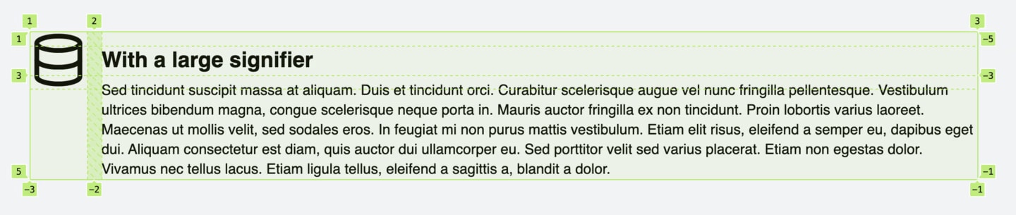
The image goes on the first three rows in the first column, and the content goes in the last three rows in the second column using named grid areas:

grid-template-areas:
  'signifier .'
  'signifier content'
  'signifier content'
  '.         content';

Read Jay’s post for a little more trickery required to make it entirely resilient.

I love the kind of post that zeroes in on the mental model behind CSS grid like this. It’s like… how can I slice up this design with arbitrary columns and rows, knowing that I can place things on arbitrary rectangular combinations of cells with any type of alignment, to best suit this design?

Direct Link to ArticlePermalink


The post Bulletproof flag components appeared first on CSS-Tricks.

You can support CSS-Tricks by being an MVP Supporter.


source https://www.jayfreestone.com/writing/bulletproof-flag/

Styling Web Components

Nolan Lawson has a little emoji-picker-element that is awfully handy and incredibly easy to use. But considering you’d probably be using it within your own app, it should be style-able so it can incorporated nicely anywhere. How to allow that styling isn’t exactly obvious:

What wasn’t obvious to me, though, was how to allow users to style it. What if they wanted a different background color? What if they wanted the emoji to be bigger? What if they wanted a different font for the input field?

Nolan list four possibilities (I’ll rename them a bit in a way that helps me understand them).

  1. CSS Custom Properties: Style things like background: var(--background, white);. Custom properties penetrate the Shadow DOM, so you’re essentially adding styling hooks.
  2. Pre-built variations: You can add a class attribute to the custom elements, which are easy to access within CSS inside the Shadow DOM thanks to the pseudo selectors, like :host(.dark) { background: black; }.
  3. Shadow parts: You add attributes to things you want to be style-able, like <span part="foo">, then CSS from the outside can reach in like custom-component::part(foo) { }.
  4. User forced: Despite the nothing in/nothing out vibe of the Shadow DOM, you can always reach the element.shadowRoot and inject a <style>, so there is always a way to get styles in.

It’s probably worth a mention that the DOM you slot into place is style-able from “outside” CSS as it were.

This is such a funky problem. I like the Shadow DOM because it’s the closest thing we have on the web platform to scoped styles which are definitely a good idea. But I don’t love any of those styling solutions. They all seem to force me into thinking about what kind of styling API I want to offer and document it, while not encouraging any particular consistency across components.

To me, the DOM already is a styling API. I like the scoped protection, but there should be an easy way to reach in there and style things if I want to. Seems like there should be a very simple CSS-only way to reach inside and still use the cascade and such. Maybe the dash-separated custom-element name is enough? my-custom-elemement li { }. Or maybe it’s more explicit, like @shadow my-custom-element li { }. I just think it should be easier. Constructable Stylesheets don’t seem like a step toward make it easier, either.

Last time I was thinking about styling web components, I was just trying to figure out how to it works in the first place, not considering how to expose styling options to consumers of the component.

Does this actually come up as a problem in day-to-day work? Sure does.

I don’t see any particularly good options in that thread (yet) for the styling approach. If I was Dave, I’d be tempted to just do nothing. Offer minimal styling, and if people wanna style it, they can do it however they want from their copy of the component. Or they can “force” the styles in, meaning you have complete freedom.


The post Styling Web Components appeared first on CSS-Tricks.

You can support CSS-Tricks by being an MVP Supporter.


source https://css-tricks.com/styling-web-components/

Friday, January 29, 2021

GreenSock ScrollTrigger

High five to the Greensock gang for the ScrollTrigger release. The point of this new plugin is triggering animation when a page scrolls to certain positions, as well as when certain elements are in the viewport. Anything you’d want configurable about it, is. There’s been plenty of scroll-position libraries over the years, but Greensock has a knack for getting the APIs and performance just right — not to mention that because what you want is to trigger animations, now you’ve got Greensock at your fingertips making sure you’re in good hands. It’s tightly integrated with all the other animation possibilities of GSAP (e.g. animating a timeline based on scroll position).

They’ve got docs and a bunch of examples. I particularly like how they have a mistakes section with ways you can screw it up. Every project should do that.

CodePen is full of examples too, so I’ll take the opportunity to drop some here for your viewing pleasure. Note that while this is a paid plugin, you can play with it on CodePen for free (search for it).

Screenshot of CodePen JavaScript settings with a completed search for greensock scroll to plugin in the external scripts section.

If you’re worried about too much motion, that’s something that you can do responsibly through prefers-reduced-motion, which is available both as a CSS media query and in JavaScript.


The post GreenSock ScrollTrigger appeared first on CSS-Tricks.

You can support CSS-Tricks by being an MVP Supporter.


source https://css-tricks.com/greensock-scrolltrigger/

A Whole Website in a Single HTML File

I can’t stop thinking about this site. It looks like a pretty standard fare; a website with links to different pages. Nothing to write home about except that… the whole website is contained within a single HTML file.

What about clicking the navigation links, you ask? Each link merely shows and hides certain parts of the HTML.

<section id="home">
  <!-- home content goes here -->
</section>
<section id="about">
  <!-- about page goes here -->
</section>

Each <section> is hidden with CSS:

section { display: none; }

Each link in the main navigation points to an anchor on the page:

<a href="#home">Home</a>
<a href="#about">About</a>

And once you click a link, the <section> for that particular link is displayed via:

section:target { display: block; }

See that :target pseudo selector? That’s the magic! Sure, it’s been around for years, but this is a clever way to use it for sure. Most times, it’s used to highlight the anchor on the page once an anchor link to it has been clicked. That’s a handy way to help the user know where they’ve just jumped to.

Anyway, using :target like this is super smart stuff! It ends up looking like just a regular website when you click around:

Direct Link to ArticlePermalink


The post A Whole Website in a Single HTML File appeared first on CSS-Tricks.

You can support CSS-Tricks by being an MVP Supporter.


source https://john-doe.neocities.org/

Components: Server-Side vs. Client-Side

Building a website in 2021? I’m guessing you’re going to take a component-driven approach. It’s all the chatter these days. React and Vue are everywhere (is Angular still a thing?), while other emerging frameworks continue to attempt a push into the spotlight.

Over the last decade or so we’ve seen an explosion of frameworks and tools that help us build sites systematically using components. Early frameworks like AngularJS helped shape the generic concept of web components. Web components are also reusable bits of HTML code that are written in JavaScript and made functional by the browser. They are client-side components.

But components, in a more generic sense, have actually been around much longer. In fact, they go back to the early days of the web. They just haven’t typically been called components, though they still function as such. Server components are also reusable bits of code, but are compiled into HTML before the browser sees them. They are server-side components, and they are still very much a thing today.

Even in a world in which all it seems like we hear is “React, React, React,” both types of components are still relevant and can help us build super awesome websites. Let’s explore how client and server components differ from one another. That will give us a clearer picture of where we came from. And then we’ll have the information we need to dream about the future.

Rendering

Perhaps the biggest difference between client-side and server-side components is what makes them what they are. That is the thing that is responsible for rendering them.

Server components are rendered by — you guessed it! — the server. They aren’t typically referred to as components. They’re often called partials, includes, snippets, or templates, depending on the framework in which they are used.

Server components can take two flavors. The first is the classic approach, which is to render components in real-time based on a request from the client. See here:

Illustrated diagram of a browser making a request to an app server that requests components, which compile to a page and are returned to the app server to go back to the browser.
Server-side rendered components

The second flavor is the Jamstack approach. In this case, the entire site is compiled during a build a process, and static HTML is already available when requested by the client. See here:

An illustrated diagram showing the browser requests a page that has already been created, which consists of components that have gone through a build process from the server, then returns to the browser.
Server components on a Jamstack site have already been compiled into HTML.

In both cases, the client (i.e. your browser) never sees the distinction between your components. It simply receives a bunch of HTML from the server.

Client components, on the other hand, are rendered by — you are two-for-two and on a ROLL! — the client. They are written in JavaScript and rendered by the client (your browser). Because the server is the server and it knows all, it can know about your client components, but whether it cares enough to do anything with them depends on the framework you’re using.

Like server components, there are also two flavors of client components. The first is the more official web component, which makes use of the shadow DOM. The shadow DOM helps with encapsulating styles and other functionality (we’ll talk more about this later). Frameworks like Polymer and Stencil make use of the shadow DOM.

The more popular frameworks, like React and Vue, represent the second flavor of component, which handles DOM manipulation and scoping on their own.

Interactivity

Because server components are just HTML when they are sent to the client, if they are to be interactive on the front end, the application must load JavaScript code separately.

Consider a countdown timer. Its presentation is determined by HTML and CSS (we‘ll come back to the CSS part). But if it is to do its thing (count), it also needs some JavaScript. That means not just bringing in that JavaScript, but also having a means by which the JavaScript can attach itself to the countdown’s HTML element(s), which must either be done manually or with (yet) another framework.

An illustrated diagram showing the browser requesting both a JavaScript bundler containing the JavaScript for the component, and a page with the component's markup that both are returned to the browser.
A component’s HTML and JavaScript are separated in SSR components.

Though this may feel unnecessarily tedious (especially if you’ve been around long enough to have been forced into this approach), there are benefits to it. It is a clear separation of concerns, where server-side code lives in one place, while the functionality lives in another. And it brings only the code it needs for the interactivity (theoretically), which can lessen the burden on the browser.

With client components, the markup and interactivity tend to be tightly coupled, often in the same file or directory. While this can quickly become a mess if you’re not diligent about staying organized, one major benefit to client components is that they already have access to the client. And because they are written in JavaScript, their functionality can ship right alongside their markup (and styles).

A diagram showing the same flow as before, but both the component markup and JavaScript are included in the bundler, which then renders on the page.
Client-side components are all wrapped up in JavaScript code.

Performance

In a one-to-one comparison, server-side components tend to perform better. When the page that a browser receives contains everything it needs for presentation, it’s going to be able to deliver that presentation to the user much quicker.

Diagram showing the browser asking for a page of HTML in a single request.
Technically all you need when rendering SSR components is a single request.

Because client-side components require JavaScript, the browser must download or process additional information (often in separate files) to be able to render the component.

Same diagram as before, but a bundler is requested by the browser along with the page.
Client component often require more code and requests.

That said, client-side components are often used within the context of a larger framework. React has Gatsby and Next, while Vue has Nuxt. These frameworks have mechanisms for creating a superior in-app experience. What I mean is that, while they may be slower to load the first page you visit on a site, they can then focus their energy on delivering subsequent views extremely fast — often faster than a server-side rendered site can deliver its content.

If you’re thinking, Yeah but what about pre-rendering and…

Yes, you’re right. We’ll get there. Also, no more spoilers, please. The rest of us are along for the ride.

Languages

Server components can be written in (almost) any server-side language. This enables you to write your templates in the same language as your application’s logic. For example, applications written with Ruby on Rails use ERB templating by default, which is a form of Ruby. Thus, Rails apps use the same language for the application itself as it does for its components.

The reason client components are written in JavaScript is because that’s the language browsers parse for interactivity on a website. However, JavaScript also has server-based runtimes, the most popular of which is Node.js. That means code for client components could be written in the same language as the application, as long as the application is written with Node (or similar).

Styling (CSS)

When it comes to styling components, server-side components run into the same trouble they face with JavaScript. The styles are typically detached from the components, and require a bit of extra effort to tie styles to the elements on the page.

However, there are frameworks like Tailwind CSS that are working to make this process less painful.

Many client-side component libraries come with CSS support (or at least a pattern for styling) right out of the box. That often means including the styles in the same file as the markup and logic, which can get messy. But typically, with a little effort, you can adjust that approach to your liking.

Welcome to the (hybrid) future

Neither type of component is the answer by itself. Server-side components require additional effort in styling and interactivity that feels unnecessary when we look at the offerings of client components. But then client components have a tendency to take away from performance on the front end. And because the success of a website often depends on user engagement, a lack of performance can hurt the end result and be enough not to want to use client components.

What does that mean for a future that demands both performance and a good developer experience? More than likely, a hybrid approach.

Components are going to have to be rendered on the server side. They just are. That‘s how we optimize performance, and good performance is going to continue to be an attribute of successful websites. But, now that we’ve seen the ease of front-end logic and interactivity using frameworks, again, like React and Vue, those frameworks are here to stay (at least for awhile).

So where are we going?

I think we’re going to see these components come together in three ways in the very near future.

1. Advancement of JavaScript framework frameworks

Remember when you thought up that spoiler about pre-rendering? Well, let’s talk about it now.

Frameworks like Gatsby, Next, and Nuxt act as front-end engines built on top of component frameworks, like React and Vue. They bring together tooling to build a comprehensive front-end experience using their preferred framework. One such feature is pre-rendering, which means these engines will introspect components and then write static HTML on the page while the site is being built. Then, when users view that page, it‘s actually already there. They don’t need JavaScript to view it.

However, JavaScript comes into play through a process called hydration. After the page loads and your user sees all the (static) content, that’s when JavaScript goes to work. It takes over the components to make them interactive. This provides the opportunity to build a client-side, component-based website with some of the benefits of the server, namely performance and SEO.

These tools have gotten super popular because of this approach, and I suspect we’ll see them continue to advance.

2. Baked-in client-side pre-rendering

That’s a lot of compound words.

What I‘ve been thinking about a lot the last couple years is: Why doesn’t React (or Vue) take on server-side rendering? They do, it’s just not super easy to understand or implement without another framework to help.

On one hand, I understand the single-responsibility principle, and that these component frameworks are just ways to build client-side components. But it felt like a huge miss to delegate server-side rendering to bigger, more complex tools like Gatsby and Next (among others).

Well, React has started moving that way. Vue is already there. And Svelte has made this approach a priority from the beginning.

I think we‘re going to see a lot more development while these traditionally client-side-focused tools solve for server-side rendering. I suspect that also means we‘ll hear a little more from Svelte in the future, which seems like it’s ahead of the game in this regard.

That may also lead to the development of more competitors to bulkier tools like Gatsby and Next. For example, look at what Netlify is doing with their website. It‘s an Eleventy project that pulls in Vue components and renders them for use on the server. What it’s missing is the hydration and interactivity piece. I expect that to come together in the very near future.

3. Server-side component interactivity

And still, we can‘t discount the continued use of server-side components. The one side effect of both of the other two advancements is that they’re still using JavaScript frameworks that can feel unnecessary when you only need just a little interactivity.

There must be a simpler way to add just a little JavaScript to make a server-side component that are written in a server-side language more interactive.

Solving that problem seems to be the approach from the folks at Basecamp, who just released Hotwire, which is a means to bring some of the gains of client components to the server, using (almost) any server-side language.

I don‘t know if that means we‘re going to see competition to Hotwire emerge right away. But I do think Hotwire is going to get some attention. And that might just bring folks back to working with full-stack monolithic frameworks like Rails. (Personally, I love that Rails hasn’t become obsolete in this JavaScript-focused world. The more competition we have, the better the web gets.)

Where do you think all this component business is going? Let’s talk about it.


The post Components: Server-Side vs. Client-Side appeared first on CSS-Tricks.

You can support CSS-Tricks by being an MVP Supporter.


source https://css-tricks.com/components-server-side-vs-client-side/

Embedding an Interactive Analytics Component with Cumul.io and Any Web Framework

In this article, we explain how to build an integrated and interactive data visualization layer into an application with Cumul.io. To do so, we’ve built a demo application that visualizes Spotify Playlist analytics! We use Cumul.io as our interactive dashboard as it makes integration super easy and provides functionality that allow interaction between the dashboard and applications (i.e. custom events). The app is a simple JavaScript web app with a Node.js server, although you can, if you want, achieve the same with Angular, React and React Native while using Cumul.io dashboards too.

Here, we build dashboards that display data from the The Kaggle Spotify Dataset 1921–2020, 160k+ Tracks and also data via the Spotify Web API when a user logs in. We’ve built dashboards as an insight into playlist and song characteristics. We’ve added some Cumul.io custom events that will allow any end user visiting these dashboards to select songs from a chart and add them to one of their own Spotify playlists. They can also select a song to display more info on them, and play them from within the application. The code for the full application is also publicly available in an open repository.

Here’s a sneak peak into what the end result for the full version looks like:

What are Cumul.io custom events and their capabilities?

Simply put, Cumul.io custom events are a way to trigger events from a dashboard, to be used in the application that the dashboard is integrated in. You can add custom events into selected charts in a dashboard, and have the application listen for these events.

Why? The cool thing about this tool is in how it allows you to reuse data from an analytics dashboard, a BI tool, within the application it’s built into. It gives you the freedom to define actions based on data, that can be triggered straight from within an integrated dashboard, while keeping the dashboard, analytics layer a completely separate entity to the application, that can be managed separately to it.

What they contain: Cumul.io custom events are attached to charts rather than dashboards as a whole. So the information an event has is limited to the information a chart has.

An event is simply put a JSON object. This object will contain fields such as the ID of the dashboard that triggered it, the name of the event and a number of other fields depending on the type of chart that the event was triggered from. For example, if the event was triggered from a scatter plot, you will receive the x-axis and y-axis values of the point it was triggered from. On the other hand, if it were triggered from a table, you would receive column values for example. See examples of what these events will look like from different charts:

// 'Add to Playlist' custom event from a row in a table
{
 "type":"customEvent",
 "dashboard":"xxxx",
 "name":"xxxx",
 "object":"xxxx",
 "data":{
   "language":"en",
   "columns":[
     {"id":"Ensueno","value":"Ensueno","label":"Name"}, 
     {"id":"Vibrasphere","value":"Vibrasphere","label":"Artist"}, 
     {"value":0.406,"formattedValue":"0.41","label":"Danceability"}, 
     {"value":0.495,"formattedValue":"0.49","label":"Energy"}, 
     {"value":180.05,"formattedValue":"180.05","label":"Tempo (bpm)"}, 
     {"value":0.568,"formattedValue":"0.5680","label":"Accousticness"}, 
     {"id":"2007-01-01T00:00:00.000Z","value":"2007","label":"Release Date (Yr)"},
   ],
   "event":"add_to_playlist"
 }
}
//'Song Info' custom event from a point in a scatter plot
{
 "type":"customEvent",
 "dashboard":"xxxx",
 "name":"xxxx",
 "object":"xxxx",
 "data":{
   "language":"en",
   "x-axis":{"id":0.601,"value":"0.601","label":"Danceability"},
   "y-axis":{"id":0.532,"value":"0.532","label":"Energy"},
   "name":{"id":"xxxx","value":"xxx","label":"Name"},
   "event":"song_info"
  }
}

The possibilities with this functionality are virtually limitless. Granted, depending on what you want to do, you may have to write a couple more lines of code, but it is unarguably quite a powerful tool!

The dashboard

We won’t actually go through the dashboard creation process here and we’ll focus on the interactivity bit once it’s integrated into the application. The dashboards integrated in this walk through have already been created and have custom events enabled. You can, of course create your own ones and integrate those instead of the one we’ve pre-built (you can create an account with a free trial). But before, some background info on Cumul.io dashboards;

Cumul.io offers you a way to create dashboards from within the platform, or via its API. In either case, dashboards will be available within the platform, decoupled from the application you want to integrate it into, so can be maintained completely separately.

On your landing page you’ll see your dashboards and can create a new one:

You can open one and drag and drop any chart you want:

You can connect data which you can then drag and drop into those charts:

And, that data can be one of a number of things. Like a pre-existing database which you can connect to Cumul.io, a dataset from a data warehouse you use, a custom built plugin etc.

Enabling custom events

We have already enabled these custom events to the scatter plot and table in the dashboard used in this demo, which we will be integrating in the next section. If you want to go through this step, feel free to create your own dashboards too!

First thing you need to do will be to add custom events to a chart. To do this, first select a chart in your dashboard you’d like to add an event to. In the chart settings, select Interactivity and turn Custom Events on:

To add an event, click edit and define its Event Name and Label. Event Name is what your application will receive and Label is the one that will show up on your dashboard. In our case, we’ve added 2 events; ‘Add to Playlist’ and ‘Song Info’:

This is all the setup you need for your dashboard to trigger an event on a chart level. Before you leave the editor, you will need your dashboard ID to integrate the dashboard later. You can find this in the Settings tab of your dashboard. The rest of the work remains on application level. This will be where we define what we actually want to do once we receive any of these events.

Takeaway points

  1. Events work on a chart level and will include information within the limits of the information on the chart
  2. To add an event, go to the chart settings on the chart you want to add them to
  3. Define name and label of event. And you’re done!
  4. (Don’t forget to take note of the dashboard ID for integration)

Using custom events in your own platform

Now that you’ve added some events to the dashboard, the next step is to use them. The key point here is that, once you click an event in your dashboard, your application that integrates the dashboard receives an event. The Integration API provides a function to listen to these events, and then it’s up to you to define what you do with them. For more information on the API and code examples for your SDK, you can also check out the relevant developer docs.

For this section, we’re also providing an open GitHub repository (separate to the repository for the main application) that you can use as a starting project to add custom events to.

The cumulio-spotify-datatalks repository is structured so that you can checkout on the commit called skeleton to start from the beginning. All the following commits will represent a step we go through here. It’s a boiled down version of the full application, focusing on the main parts of the app that demonstrates Custom Events. I’ll be skipping some steps such as the Spotify API calls which are in src/spotify.js, so as to limit this tutorial to the theme of ‘adding and using custom events’.

Useful info for following steps

Let’s have a look at what happens in our case. We had created two events; add_to_playlist and song_info. We want visitors of our dashboard to be able to add a song to their own playlist of choice in their own Spotify account. In order to do so, we take the following steps:

  1. Integrate the dashboard with your app
  2. Listen to incoming events

Integrate the dashboard with your app

First, we need to add a dashboard to our application. Here we use the Cumul.io Spotify Playlist dashboard as the main dashboard and the Song Info dashboard as the drill through dashboard (meaning we create a new dashboard within the main one that pops up when we trigger an event). If you have checked out on the commit called skeleton and npm run start, the application should currently just open up an empty ‘Cumul.io Favorites’ tab, with a Login button at the top right. For instructions on how to locally run the project, go to the bottom of the article:

To integrate a dashboard, we will need to use the Cumulio.addDashboard() function. This function expects an object with dashboard options. Here’s what we do to add the dashboard:

In src/app.js, we create an object that stores the dashboard IDs for the main dashboard and the drill through dashboard that displays song info alongside a dashboardOptions object:

// create dashboards object with the dashboard ids and dashboardOptions object

// !!!change these IDs if you want to use your own dashboards!!!
const dashboards = {
  playlist: 'f3555bce-a874-4924-8d08-136169855807', 
  songInfo: 'e92c869c-2a94-406f-b18f-d691fd627d34',
};

const dashboardOptions = {
  dashboardId: dashboards.playlist,
  container: '#dashboard-container',
  loader: {
    background: '#111b31',
    spinnerColor: '#f44069',
    spinnerBackground: '#0d1425',
    fontColor: '#ffffff'
  }
};

We create a loadDashboard() function that calls Cumulio.addDashboard(). This function optionally receives a container and modifies the dashboardOptions object before adding dashboard to the application.

// create a loadDashboard() function that expects a dashboard ID and container

const loadDashboard = (id, container) => {
  dashboardOptions.dashboardId = id;
  dashboardOptions.container = container || '#dashboard-container';  
  Cumulio.addDashboard(dashboardOptions);
};

Finally, we use this function to add our playlist dashboard when we load the Cumul.io Favorites tab:

export const openPageCumulioFavorites = async () => {
  ui.openPage('Cumul.io playlist visualized', 'cumulio-playlist-viz');
  /**************** INTEGRATE DASHBOARD ****************/
  loadDashboard(dashboards.playlist);
};

At this point, we’ve integrated the playlist dashboard and when we click on a point in the Energy/Danceability by Song scatter plot, we get two options with the custom events we added earlier. However, we’re not doing anything with them yet.

Listen to incoming events

Now that we’ve integrated the dashboard, we can tell our app to do stuff when it receives an event. The two charts that have ‘Add to Playlist’ and ‘Song Info’ events here are:

First, we need to set up our code to listen to incoming events. To do so, we need to use the Cumulio.onCustomEvent() function. Here, we chose to wrap this function in a listenToEvents() function that can be called when we load the Cumul.io Favorites tab. We then use if statements to check what event we’ve received:

const listenToEvents = () => {
  Cumulio.onCustomEvent((event) => {
    if (event.data.event === 'add_to_playlist'){
      //DO SOMETHING
    }
    else if (event.data.event === 'song_info'){
      //DO SOMETHING
    }
  });
};

This is the point after which things are up to your needs and creativity. For example, you could simply print a line out to your console, or design your own behaviour around the data you receive from the event. Or, you could also use some of the helper functions we’ve created that will display a playlist selector to add a song to a playlist, and integrate the Song Info dashboard. This is how we did it;

Add song to playlist

Here, we will make use of the addToPlaylistSelector() function in src/ui.js. This function expects a Song Name and ID, and will display a window with all the available playlists of the logged in user. It will then post a Spotify API request to add the song to the selected playlist. As the Spotify Web API requires the ID of a song to be able to add it, we’ve created a derived Name & ID field to be used in the scatter plot.

An example event we receive on add_to_playlist will include the following for the scatter plot:

"name":{"id":"So Far To Go&id=3R8CATui5dGU42Ddbc2ixE","value":"So Far To Go&id=3R8CATui5dGU42Ddbc2ixE","label":"Name & ID"}

And these columns for the table:

"columns":[
 {"id":"Weapon Of Choice (feat. Bootsy Collins) - Remastered Version","value":"Weapon Of Choice (feat. Bootsy Collins) - Remastered Version","label":"Name"},
 {"id":"Fatboy Slim","value":"Fatboy Slim","label":"Artist"},  
 // ...
 {"id":"3qs3aHNUcqFGv7jMYJJCYa","value":"3qs3aHNUcqFGv7jMYJJCYa","label":"ID"}
]

We extract the Name and ID of the song from the event via the getSong() function, then call the ui.addToPlaylistSelector() function:

/*********** LISTEN TO CUSTOM EVENTS AND ADD EXTRAS ************/
const getSong = (event) => {
  let songName;
  let songArtist;
  let songId;
  if (event.data.columns === undefined) {
    songName = event.data.name.id.split('&id=')[0];
    songId = event.data.name.id.split('&id=')[1];
  }
  else {
    songName = event.data.columns[0].value;
    songArtist = event.data.columns[1].value;
    songId = event.data.columns[event.data.columns.length - 1].value;
  }
  return {id: songId, name: songName, artist: songArtist};
};

const listenToEvents = () => {
  Cumulio.onCustomEvent(async (event) => {
    const song = getSong(event);
    console.log(JSON.stringify(event));
    if (event.data.event === 'add_to_playlist'){
      await ui.addToPlaylistSelector(song.name, song.id);
    }
    else if (event.data.event === 'song_info'){
      //DO SOMETHING
    }
  });
};

Now, the ‘Add to Playlist’ event will display a window with the available playlists that a logged in user can add the song to:

Display more song info

The final thing we want to do is to make the ‘Song Info’ event display another dashboard when clicked. It will display further information on the selected song, and include an option to play the song. It’s also the step where we get into more some more complicated use cases of the API which may need some background knowledge. Specifically, we make use of Parameterizable Filters. The idea is to create a parameter on your dashboard, for which the value can be defined while creating an authorization token. We include the parameter as metadata while creating an authorization token.

For this step, we have created a songId parameter that is used in a filter on the Song Info dashboard:

Then, we create a getDashboardAuthorizationToken() function. This expects metadata which it then posts to the /authorization endpoint of our server in server/server.js:

const getDashboardAuthorizationToken = async (metadata) => {
  try {
    const body = {};
    if (metadata && typeof metadata === 'object') {
      Object.keys(metadata).forEach(key => {
        body[key] = metadata[key];
      });
    }

    /*
      Make the call to the backend API, using the platform user access credentials in the header
      to retrieve a dashboard authorization token for this user
    */
    const response = await fetch('/authorization', {
      method: 'post',
      body: JSON.stringify(body),
      headers: { 'Content-Type': 'application/json' }
    });

    // Fetch the JSON result with the Cumul.io Authorization key & token
    const responseData = await response.json();
    return responseData;
  }
  catch (e) {
    return { error: 'Could not retrieve dashboard authorization token.' };
  }
};

Finally, we use the load the songInfo dashboard when the song_info event is triggered. In order to do this, we create a new authorization token using the song ID:

const loadDashboard = (id, container, key, token) => {
  dashboardOptions.dashboardId = id;
  dashboardOptions.container = container || '#dashboard-container';  

  if (key && token) {
    dashboardOptions.key = key;
    dashboardOptions.token = token;
  }

  Cumulio.addDashboard(dashboardOptions);
};

We make some modifications to the loadDashboard() function so as to use the new token:

const loadDashboard = (id, container, key, token) =u003e {n  dashboardOptions.dashboardId = id;n  dashboardOptions.container = container || '#dashboard-container';  nn  if (key u0026u0026 token) {n    dashboardOptions.key = key;n    dashboardOptions.token = token;n  }nn  Cumulio.addDashboard(dashboardOptions);n};

Then call the ui.displaySongInfo(). The final result looks as follows:

const listenToEvents = () => {
  Cumulio.onCustomEvent(async (event) => {
    const song = getSong(event);
    if (event.data.event === 'add_to_playlist'){
      await ui.addToPlaylistSelector(song.name, song.id);
    }
    else if (event.data.event === 'song_info'){
      const token = await getDashboardAuthorizationToken({ songId: [song.id] });
      loadDashboard(dashboards.songInfo, '#song-info-dashboard', token.id, token.token);
      await ui.displaySongInfo(song);
    }
  });
};

And voilá! We are done! In this demo we used a lot of helper functions I haven’t gone through in detail, but you are free clone the demo repository and play around with them. You can even disregard them and build your own functionality around the custom events.

Conclusion

For any one intending to have a layer of data visualisation and analytics integrated into their application, Cumul.io provides a pretty easy way of achieving it as I’ve tried to demonstrate throughout this demo. The dashboards remain decoupled entities to the application that can then go on to be managed separately. This becomes quite an advantage if say you’re looking at integrated analytics within a business setting and you’d rather not have developers going back and fiddling with dashboards all the time.

Events you can trigger from dashboards and listen to in their host applications on the other hand allows you to define implementations based off of the information in those decoupled dashboards. This can be anything from playing a song in our case to triggering a specific email to be sent. The world is your oyster in this sense, you decide what to do with the data you have from your analytics layer. In other words, you get to reuse the data from your dashboards, it doesn’t have to just stay there in its dashboard and analytics world 🙂

Steps to run this project

Before you start:

  1. Clone the cumulio-spotify-datatalks repository with npm install
  2. Create a .env file in the root directory and add the following from your Cumul.io and Spotify Developer accounts:
  3. From Cumul.io: CUMULIO_API_KEY=xxx CUMULIO_API_TOKEN=xxx
  4. From Spotify: SPOTIFY_CLIENT_ID=xxx SPOTIFY_CLIENT_SECRET=xxx ACCESS_TOKEN=xxx REFRESH_TOKEN=xxxnpm run start
  5. On your browser, go to http://localhost:3000/ and log into your Spotify account 🥳

The post Embedding an Interactive Analytics Component with Cumul.io and Any Web Framework appeared first on CSS-Tricks.

You can support CSS-Tricks by being an MVP Supporter.


source https://css-tricks.com/embedding-an-interactive-analytics-component-with-cumul-io-and-any-web-framework/

Thursday, January 28, 2021

The Holy Grail Layout with CSS Grid

A reader wrote in asking specifically how to build this layout in CSS Flexbox:

My answer: That’s not really a layout for CSS Flexbox. You could pull it off if you had to, but you’d need some kind of conceit, like grouping the nav and article together in a parent element (if not more grouping). CSS Grid was born to describe this kind of layout and it will be far easier to work with, not to mention that the browser support for both is largely the same these days.

What do you mean by “Holy Grail”?

See, kids, layout on the web used to be so janky that the incredible simple diagram above was relatively difficult to pull off, particularly if you needed the “columns” there to match heights. I know, ridiculous, but that was the deal. We used super weird hacks to get it done (like huge negative margins paired with positive padding), which evolved over time to cleaner tricks (like background images that mimicked columns). Techniques that did manage to pull it off referred to it as the holy grail. (Just for extra clarity, usually, holy grail meant a three-column layout with content in the middle, but the main point was equal height columns).

CSS is much more robust now, so we can use it without resorting to hacks to do reasonable things, like accomplish this basic layout.

Here it is in CSS Grid

This grid is set up both with grid-template-columns and grid-template-rows. This way we can be really specific about where we want these major site sections to fall.

I slipped in some extra stuff

  • I had another question come my way the other day about doing 1px lines between grid areas. The trick there is as simple as the parent having a background color and using gap: 1px;, so I’ve done that in the demo above.
  • It’s likely that small screens move down to a single-column layout. I’ve done that at a media query above. Sometimes I use display: block; on the parent, turning off the grid, but here I’ve left grid on and reset the columns and rows. This way, we still get the gap, and we can shuffle things around if needed.
  • Another recent question I was asked about is the subtle “body border” effect you can see in the demo above. I did it about as simple as possible, with a smidge of padding between the body and the grid wrapper. I originally did it between the body and the HTML element, but for full-page grids, I think it’s smarter to use a wrapper div than use the body for the grid. That way, third-party things that inject stuff into the body won’t cause layout weirdness.

The post The Holy Grail Layout with CSS Grid appeared first on CSS-Tricks.

You can support CSS-Tricks by being an MVP Supporter.


source https://css-tricks.com/the-holy-grail-layout-with-css-grid/

Wednesday, January 27, 2021

Monorepo

I’m not exactly a large-scale DevOps guy, but I can tell ya we’ve been moving back toward a monorepo at CodePen and it’s rife with advantages over a system with lots of smaller repos. For us, I mean. It’s very likely that you have entirely different challenges and have come to entirely different conclusions at your place. 🤙

I was thinking about this after reading Ben Nadel’s “Why I’ve Been Merging Microservices Back Into The Monolith At InVision.” Even though our conclusions are similar, I can tell he faces an entirely different set of problems.

Microservices Solve Both Technical and People Problems

technical problem is one in which an aspect of the application is putting an undue burden on the infrastructure; which, in turn, is likely causing a poor user experience (UX). For example, image processing requires a lot of CPU. If this CPU load becomes too great, it could start starving the rest of the application of processing resources. This could affect system latency. And, if it gets bad enough, it could start affecting system availability.


people problem, on the other hand, has little to do with the application at all and everything to do with how your team is organized. The more people you have working in any given part of the application, the slower and more error-prone development and deployment becomes. For example, if you have 30 engineers all competing to “Continuously Deploy” (CD) the same service, you’re going to get a lot of queuing; which means, a lot of engineers that could otherwise be shipping product are actually sitting around waiting for their turn to deploy.

Advantages of the Monorepo (for us)

  • One ring to rule them all. You git pull one repo and you are 100% up to date with everyone else and have everything you need for a complete dev environment.
  • No stray puppies. There is no confusion on where the action happens on GitHub. You do pull requests against the monorepo. You open issues on the monorepo. This avoids scattered activity that gets lost.
  • Kumbaya. You can share code. It can be particularly helpful to share utilities or components anywhere in the codebase. We poked at ideas like publishing shared bits to npm for other repos to use, but that workflow was janky compared to having the code together in on place.
  • Growing old together. There are no old and neglected repos, because it’s just one. For our small team, having dozens of repos meant some of them had old outdated dependencies, ancient versions of Node, linting and formatting rules that were out of sync with other repos, etc.

Disadvantages of the Monorepo (for us)

  • Deployment trickiness. I think the main reason we split off repos originally is that the code in those repos needed to go to unique places. They might have represented an individual Lambda or individual service on some other server. An individual repo means it’s easier to hook up stuff that is unique to that server/service, like CI/CD.

Yes, I get that this is controversial.

I actually don’t care that much. I’m not gonna get all intense about this like air fryer people and CrossFit zealots. Here’s a full-throated argument against monorepos from Matt Klein.

I’m just saying: it’s been clearly useful for us. I can see how things play out differently for other companies. I can see how a company that works with contractors might want to limit their access to something less than an entire monorepo. I can see how a git repo might become unwieldy and large. Those aren’t problems for us at CodePEn right now, so the advantages of a monorepo win.


The post Monorepo appeared first on CSS-Tricks.

You can support CSS-Tricks by being an MVP Supporter.


source https://css-tricks.com/monorepo/

Re-Creating the Porky Pig Animation from Looney Tunes in CSS

You know, Porky Pig coming out of those red rings announcing the end of a Looney Tunes cartoon. We’ll get there, but first we need to cover some CSS concepts.

Everything in CSS is a box, or rectangle. Rectangles stack, and can be displayed on top of, or below, other rectangles. Rectangles can contain other rectangles and you can style them such that the inner rectangle is visible outside the outer rectangle (so they overflow) or that they’re clipped by the outer rectangle (using overflow: hidden). So far, so good.

What if you want a rectangle to be visible outside its surrounding rectangle, but only on one side. That’s not possible, right?

The first rectangle contains an inner element that overflows both the top and bottom edges with the text "Possible" below it. The second rectangle clips the inner element on both sides, with "Also possible" below it. The third rectangle clips the inner element on the bottom, but shows it overflowing at the top, with the text "...Not possible" below it.

Perhaps, when you look at the image above, the wheels start turning: What if I copy the inner rectangle and clip half of it and then position it exactly?. But when it comes down to it, you can’t choose to have an element overflow at the top but clip at the bottom.

Or can you?

3D transforms

Using 3D transforms you can rotate, transform, and translate elements in 3D space. Here’s a group of practical examples I gathered showcasing some possibilities.

For 3D transforms to do their thing, you need two CSS properties:

  • perspective, using a value in pixels, to determine how pronounced the 3D effect is
  • transform-style: preserve-3d, to tell the browser to keep elements positioned in 3D space.

Even with the good support that 3D transforms have, you don’t see 3D transforms ‘in the wild’ all that much, sadly. Websites are still a “2D” thing, a flat page that scrolls. But as I started playing around with 3D transforms and scouting examples, I found one that was by far the most interesting as far as 3D transforms go:

Three planes floating above each other in 3D space

The image clearly shows three planes but this effect is achieved using a single <div>. The two other planes are the ::before and ::after pseudo-elements that are moved up and down respectively, using translate(), to stack on top of each other in 3D space. What is noticeable here is how the ::after element, that normally would be positioned on top of an element, is behind that element. The creator was able to achieve this by adding transform: translateZ(-1px);.

Even though this was one of many 3D transforms I had seen at this point, it was the first one that made me realize that I was actually positioning elements in 3D space. And if I can do that, I can also make elements intersect:

Two planes intersecting each other in 3D space

I couldn’t think of how this sort of thing would be useful, but then I saw the Porky Pig cartoon animation. He emerges from behind the bottom frame, but his face overlaps and stacks on top of the top edge of the same frame — the exact same sort of clipping situation we saw earlier. That’s when my wheels started turning. Could I replicate that effect using just CSS? And for extra credit, could I replicate it using a single <div>?

I started playing around and relatively quickly had this to show for it:

An orange rectangle that intersects through a blue frame. At the top of the image it's above the frame and at the bottom of the image it's below the blue frame.

Here we have a single <div> with its ::before and an ::after pseudo-elements. The div itself is transparent, the ::before has a blue border and the ::after has been rotated along the x-axis. Because the div has perspective, everything is positioned in 3D and, because of that, the ::after pseudo-element is above the border at the top edge of the frame and behind the border at the bottom edge of the frame.

Here’s that in code:

div {
  transform: perspective(3000px);
  transform-style: preserve-3d;
  position: relative;
  width: 200px;
  height: 200px;
}

div::before {
  content: "";
  width: 100%;
  height: 100%;
  border:10px solid darkblue;
}

div::after {
  content: "";
  position: absolute;
  background: orangered;
  width: 80%;
  height: 150%;
  display: block;
  left: 10%;
  bottom: -25%;
  transform: rotateX(-10deg);
}

With perspective, we can determine how far a viewer is from “z=0” which we can consider to be the “horizon” of our CSS 3D space. The larger the perspective, the less pronounced the 3D effect, and vice versa. For most 3D scenes, a perspective value between 500 and 1,000 pixels works best, though you can play around with it to get the exact effect you want. You can compare this with perspective drawing: If you draw two horizon points close together, you get a very strong perspective; but if they’re far apart, then things appear flatter.

From rectangles to cartoons

Rectangles are fun, but what I really wanted to build was something like this:

A film cell of Porky Pig coming out of a circle with the text "That's all folks."

I couldn‘t find or create a nicely cut-out version of Porky Pig from that image, but the Wikipedia page contains a nice alternative, so we’ll use that.

First, we need to split the image up into three parts:

  • <div>: the blue background behind Porky
  • ::after: all the red circles that form a sort of tunnel
  • ::before: Porky Pig himself in all his glory, set as a background image

We’ll start with the <div>. That will be the background as well as the base for the rest of the elements. It’ll also contain the perspective and transform-style properties I called out earlier, along with some sizes and the background color:

div {
  transform: perspective(3000px);
  transform-style:preserve-3d;
  position: relative;
  width: 200px;
  height: 200px;
  background: #4992AD;
}

Alright, next up, we‘ll move to the red circles. The element itself has to be transparent because that’s the opening where Porky emerges. So how shall we go about it? We can use a border just like the example earlier in this article, but we only have one border and that can have a solid color. We need a bunch of circles that can accept gradients. We can use box-shadow instead, chaining multiple shadows in the property values. This gets us all of the circles we need, and by using a blur radius value of 0 with a large spread radius, we can create the appearance of multiple “borders.”

box-shadow: <x-offset> <y-offset> <blur-radius> <spread-radius> <color>;

We‘ll use a border-radius that‘s as large as the <div> itself, making the ::before a circle. Then we’ll add the shadows. When we add a few red circles with a large spread and add blurry white, we get an effect that looks very similar to the Porky’s tunnel.

box-shadow: 0 0 20px   0px #fff, 0 0 0  30px #CF331F,
            0 0 20px  30px #fff, 0 0 0  60px #CF331F,
            0 0 20px  60px #fff, 0 0 0  90px #CF331F,
            0 0 20px  90px #fff, 0 0 0 120px #CF331F,
            0 0 20px 120px #fff, 0 0 0 150px #CF331F;

Here, we’re adding five circles, where each is 30px wide. Each circle has a solid red background. And, by using white shadows with a blur radius of 20px on top of that, we create the gradient effect.

The background and circles in pure CSS without Porky

With the background and the circles sorted, we’re now going to add Porky. Let’s start with adding him at the spot we want him to end up, for now above the circles.

div::before {
  position: absolute;
  content: "";
  width: 80%;
  height: 150%;
  display: block;
  left: 10%;
  bottom: -12%;
  background: url("Porky_Pig.svg") no-repeat center/contain;
}

You might have noticed that slash in “center/contain” for the background. That’s the syntax to set both the position (center) and size (contain) in the background shorthand CSS property. The slash syntax is also used in the font shorthand CSS property where it’s used to set the font-size and line-height like so: <font-size>/<line-height>.

The slash syntax will be used more in future versions of CSS. For example, the updated rgb() and hsl() color syntax can take a slash followed by a number to indicate the opacity, like so: rgb(0 0 0 / 0.5). That way, there’s not need to switch between rgb() and rgba(). This already works in all browsers, except Internet Explorer 11.

Porky Pig positioned above the circles

Both the size and positioning here is a little arbitrary, so play around with that as you see fit. We’re a lot closer to what we want, but now need to get it so the bottom portion of Porky is behind the red circles and his top half remains visible.

The trick

We need to transpose both the circles as well as Porky in 3D space. If we want to rotate Porky, there are a few requirements we need to meet:

  • He should not clip through the background.
  • We should not rotate him so far that the image distorts.
  • His lower body should be below the red circles and his upper body should be above them.

To make sure Porky doesn‘t clip through the background, we first move the circles in the Z direction to make them appear closer to the viewer. Because preserve-3d is applied it means they also zoom in a bit, but if we only move them a smidge, the zoom effect isn’t noticeable and we end up with enough space between the background and the circles:

transform: translateZ(20px);

Now Porky. We’re going to rotate him around the X-axis, causing his upper body to move closer to us, and the lower part to move away. We can do this with:

transform: rotateX(-10deg);

This looks pretty bad at first. Porky is partially hidden behind the blue background, and he’s also clipping through the circles in a weird way.

Porky Pig partially clipped by the background and the circles

We can solve this by moving Porky “closer” to us (like we did with the circles) using translateZ(), but a better solution is to change the position of our rotation point. Right now it happens from the center of the image, causing the lower half of the image to rotate away from us.

If we move the starting point of the rotation toward the bottom of the image, or even a little bit below that, then the entirety of the image rotates toward us. And because we already moved the circles closer to us, everything ends up looking as it should:

transform: rotateX(-10deg);
transform-origin: center 120%;
Porky Pig emerges from the circle, with his legs behind the circles but his head above them.

To get an idea of how everything works in 3D, click “show debug” in the following Pen:

Animation

If we keep things as they are — a static image — then we wouldn’t have needed to go through all this trouble. But when we animate things, we can reveal the layering and enhance the effect.

Here‘s the animation I’m going for: Porky starts out small at the bottom behind the circles, then zooms in, emerging from the blue background over the red circles. He stays there for a bit, then moves back out again.

We’ll use transform for the animation to get the best performance. And because we’re doing that, we need to make sure we keep the rotateX in there as well.

@keyframes zoom {
  0% {
    transform: rotateX(-10deg) scale(0.66);
  }
  40% {
    transform: rotateX(-10deg) scale(1);
  }
  60% {
    transform: rotateX(-10deg) scale(1);
  }
  100% {
    transform: rotateX(-10deg) scale(0.66);
  }
}

Soon, we’ll be able to directly set different transforms, as browsers have started implementing them as individual CSS properties. That means that repeating that rotateX(-10deg) will eventually be unnecessary; but for now, we have a little bit of duplication.

We zoom in and out using the scale() function and, because we’ve already set a transform-origin, scaling happens from the center-bottom of the image, which is precisely the effect we want! We’re animating the scale up to 60% of Porky’s actual size, we have the little break at the largest point, where he fully pops out of the circle frame.

The animation goes on the ::before pseudo-element. To make the animation look a little more natural, we’re using an ease-in-out timing function, which slows down the animation at the start and end.

div::before {
  animation-name: zoom;
  animation-duration: 4s;
  animation-iteration-count: infinite;
  animation-fill-mode:forwards;
  animation-timing-function: ease-in-out;
}

What about reduced motion?

Glad you asked! For people who are sensitive to animations and prefer reduced or no motion, we can reach for the prefers-reduced-motion media query. Instead of removing the full animation, we’ll target those who prefer reduced motion and use a more subtle fade effect rather than the full-blown animation.

@media (prefers-reduced-motion: reduce) {
   @keyframes zoom {
    0% {
      opacity:0;
    }
    100% {
      opacity: 1;
    }
  }

  div::before {
    animation-iteration-count: 1;
  }
}

By overwriting the @keyframes inside a media query, the browser will automatically pick it up. This way, we still accentuate the effect of Porky emerging from the circles. And by setting animation-iteration-count to 1, we still let people see the effect, but then stop to prevent continued motion.

Finishing touches

Two more things we can do to make this a bit more fun:

  • We can create more depth in the image by adding a shadow behind Porky that grows as he emerges and appears to zoom in closer to the view.
  • We can turn Porky as he moves, to embellish the pop-out effect even further.

That second part we can implement using rotateZ() in the same animation. Easy breezy.

But the first part requires an additional trick. Because we use an image for Porky, we can’t use box-shadow because that creates a shadow around the box of the ::before pseudo-element instead of around the shape of Porky Pig.

That’s where filter: drop-shadow() comes to the rescue. It looks at the opaque parts of the element and adds a shadow to that instead of around the box.

@keyframes zoom {
  0% {
    transform: rotateX(-10deg) scale(0.66);
    filter: drop-shadow(-5px 5px 5px rgba(0,0,0,0));
  }
  40% {
    transform: rotateZ(-10deg) rotateX(-10deg) scale(1);
    filter: drop-shadow(-10px 10px 10px rgba(0,0,0,0.5));
  }

  60% {
    transform: rotateZ(-10deg) rotateX(-10deg) scale(1);
    filter: drop-shadow(-10px 10px 10px rgba(0,0,0,0.5));
  }

  100% {
    transform: rotateX(-10deg) scale(0.66);
    filter: drop-shadow(-5px 5px 5px rgba(0,0,0,0));
  }
}

And that‘s how I re-created the Looney Tunes animation of Porky Pig. All I can say now is, “That’s all Folks!”


The post Re-Creating the Porky Pig Animation from Looney Tunes in CSS appeared first on CSS-Tricks.

You can support CSS-Tricks by being an MVP Supporter.


source https://css-tricks.com/re-creating-the-porky-pig-animation-from-looney-tunes-in-css/