About

Saturday, July 30, 2022

Scroll Shadows? Pure CSS Parallax? Game Back On.

Chris calls scroll shadows one his favorite CSS-Tricks of all time. Lea Verou popularized the pure CSS approach using four layered background gradients with some clever background-attachment magic. The result is a slick scrolling interaction that gives users a hint that additional content is available in a scrollable container.

Just one problem: it broke in Safari iOS 13. One day it was all good. The next, not so much. And that wasn’t the only thing affected. Keith Clark’s CSS-only parallax effect also stopped working right about then.

Well, reader Ronald wrote in to say that all is working once again! In fact, I’m writing this on my iPad (Safari 15.5) right now and Chris’s demo is looking sharp as ever. So is Keith’s original demo.

So, what broke it? We still don’t know. But the Safari 13 release notes offer clues:

  • Added support for one-finger accelerated scrolling to all frames and overflow:scroll elements eliminating the need to set-webkit-overflow-scrolling: touch.
  • Changed the default behavior on iPad for wide web pages with responsive meta-tags that require horizontal scrolling. Pages are scaled to prevent horizontal scrolling and any text is resized to preserve legibility.

When was it fixed and what fixed it? Well, on the scroll shadow side, the Safari 15.4 included some work on background-attachment: local that may have done the trick. On the parallax side, Safari 14.1 added support for individual transform properties… so maybe that?


Scroll Shadows? Pure CSS Parallax? Game Back On. originally published on CSS-Tricks. You should get the newsletter.


source https://css-tricks.com/scroll-shadows-pure-css-parallax-game-back-on/

Friday, July 29, 2022

Recreating MDN’s Truncated Text Effect

It’s no secret that MDN rolled out a new design back in March. It’s gorgeous! And there are some sweet CSS-y gems in it that are fun to look at. One of those gems is how card components handle truncated text.

Pretty cool, yeah? I wanna tear that apart in just a bit, but a couple of things really draw me into this approach:

  • It’s an example of intentionally cutting off content. We’ve referred to that as CSS data loss in other places. And while data loss is generally a bad thing, I like how it’s being used here since excerpts are meant to be a teaser for the full content.
  • This is different than truncating text with text-overflow: ellipsis, a topic that came up rather recently when Eric Eggert shared his concerns with it. The main argument against it is that there is no way to recover the text that gets cut off in the truncation — assistive tech will announce it, but sighted users have no way to recover it. MDNs approach provides a bit more control in that department since the truncation is merely visual.

So, how did MDN do it? Nothing too fancy here as far the HTML goes, just a container with a paragraph.

<div class="card">
  <p>Lorem ipsum dolor sit amet consectetur adipisicing elit. Inventore consectetur temporibus quae aliquam nobis nam accusantium, minima quam iste magnam autem neque laborum nulla esse cupiditate modi impedit sapiente vero?</p>
</div>

We can drop in a few baseline styles to shore things up.

Again, nothing too fancy. Our goal is cut the content off after, say, the third line. We can set a max-height on the paragraph and hide the overflow for that:

.card p {
  max-height: calc(4rem * var(--base)); /* Set a cut-off point for the content */
  overflow: hidden; /* Cut off the content */
}

Whoa whoa, what’s up with that calc() stuff? Notice that I set up a --base variable up front that can be used as a common multiplier. I’m using it to compute the font-size, line-height, padding for the card, and now the max-height of the paragraph. I find it easier to work with a constant values especially when the sizing I need is really based on scale like this. I noticed MDN uses a similar --base-line-height variable, probably for the same purpose.

Getting that third line of text to fade out? It’s a classic linear-gradient() on the pargraph’s :after pseudo-element, which is pinned to the bottom-right corner of the card. So, we can set that up:

.card p:after {
  content: ""; /* Needed to render the pseudo */
  background-image: linear-gradient(to right, transparent, var(--background) 80%);
  position: absolute;
  inset-inline-end: 0; /* Logical property equivalent to `right: 0` */
}

Notice I’m calling a --background variable that’s set to the same background color value that’s used on the .card itself. That way, the text appears to fade into the background. And I found that I needed to tweak the second color stop in the gradient because the text isn’t completely hidden when the gradient blends all the way to 100%. I found 80% to be a sweet spot for my eyes.

And, yes, :after needs a height and width. The height is where that --base variables comes back into play because we want that scaled to the paragraph’s line-height in order to cover the text with the height of :after.

.card p:after {
  /* same as before */
  height: calc(1rem * var(--base) + 1px);
  width: 100%; /* relative to the .card container */
}

Adding one extra pixel of height seemed to do the trick, but MDN was able to pull it off without it when I peeked at DevTools. Then again, I’m not using top (or inset-block-start) to offset the gradient in that direction either. 🤷‍♂️

Now that p:after is absolutely positioned, we need to explicitly declare relative positioning on the paragraph to keep :after in its flow. Otherwise, :after would be completely yanked from the document flow and wind up outside of the card. This becomes the full CSS for the .card paragraph:

.card p {
  max-height: calc(4rem * var(--base)); /* Set a cut-off point for the content */
  overflow: hidden; /* Cut off the content */
  position: relative; /* needed for :after */
}

We’re done, right? Nope! The dang gradient just doesn’t seem to be in the right position.

I’ll admit I brain-farted on this one and fired up DevTools on MDN to see what the heck I was missing. Oh yeah, :after needs to be displayed as a block element. It’s clear as day when adding a red border to it.🤦‍♂️

.card p:after {
  content: "";
  background: linear-gradient(to right, transparent, var(--background) 80%);
  display: block;
  height: calc(1rem * var(--base) + 1px);
  inset-block-end: 0;
  position: absolute;
  width: 100%;
}

All together now!

And, yep, looks sounds like VoiceOver respects the full text. I haven’t tested any other screen readers though.

I also noticed that MDN’s implementation removes pointer-events from p:after. Probably a good defensive tactic to prevent odd behaviors when selecting text. I added it in and selecting text does feel a little smoother, at least in Safari, Firefox, and Chrome.


Recreating MDN’s Truncated Text Effect originally published on CSS-Tricks. You should get the newsletter.


source https://css-tricks.com/recreating-mdns-truncated-text-effect/

Thursday, July 28, 2022

The Best Way to Call Stored Procedures from Java: With jOOQ

jOOQ is mainly known for its powerful type safe, embedded, dynamic SQL capabilities that are made available through code generation. However, a secondary use case of code generation is to use it for stored procedures (possibly exclusively for stored procedures). Stored procedures are powerful ways of moving complex data processing logic to the server. This … Continue reading The Best Way to Call Stored Procedures from Java: With jOOQ

from Java, SQL and jOOQ. https://ift.tt/hl1ycpK
via IFTTT

Friday, July 22, 2022

Why I Chose Angular to Build a URL Shortener

URL Shorteners are tools we use to make links shorter than they actually are. With a URL Shortener, you can transform a long link (maybe for a registration form or article) into a shorter version.

Behind the scenes, the long and short versions of a given link have been stored in some database. Then when a user visits the short link in a browser, the URL Shortener will redirect the user to the long version of the link (where the actual content is found).

Shortened links from URL shorteners are commonly used when the long version of those links would be too long to use. Sharing links on social media or when designing flyers and adverts is a popular use of URL shorteners.

For one of my projects, I created a personal URL shortener. My intention was to use it for links to articles I write or videos I make. I used Firebase to build the backend of the URL shortener. Specifically, I used the Firestore database to store short and long versions of any given link.

To create links, I had to use the Firebase console. This wasn’t a problem but it was cumbersome for the high frequency of editing links. The user experience (UX) was not ideal. Now I was faced with a problem. How do I create, edit, and delete links? I needed to build a frontend for the URL shortener. I needed a website for this.

In this article, we’ll review the available tools used for building this frontend, decision choices, and factors that influenced why they were made.

Problem statement

The project requirements were:

  • Platform/Architecture. The engineering and structure of the coding process.
  • UI Toolkit. Components to use for the various parts of the UI.
  • Convenience. Building the backend was not tough, so this frontend should not be either. I wanted clean code and fast development.

The First Decision Choice: Angular

Many ideas come to mind when starting out to build a frontend. In a broad sense, we could categorize frontend building options into 3 platforms:

  1. Website Builders – like WordPress, Wix, Squarespace, etc.
  2. Vanilla Building – using plain HTML, CSS, and JavaScript.
  3. JavaScript Framework – like React, Vue, Angular, etc.

In my experience, website builders provide a very restricted collection of widgets, components, and templates. Most website builders don’t provide an easy way to integrate an entire custom backend like Firebase. While it is possible to build impressive sites by connecting these pieces together, the degree of complexity of my project was likely beyond what these services typically provide.

Using the no-framework style or vanilla would have been a possibility. However, the deciding factor that made me not choose the pure vanilla route was that the latest non-CDN version of the Firebase JavaScript SDK (Version 9) is designed with installation via npm or yarn and module bundling in mind.

JavaScript frameworks handle frontend core parts (like routing, backend-linking, etc.) to reduce developer efforts. There are many of them and choosing which to use seemed to be a harder choice to make.

There are many JavaScript frameworks for frontend development. Examples include Angular, React, Vue, etc.

Of the available frameworks, I have the most familiarity with Angular. This is because I have used it on previous projects like:

  • Choir Carol Quiz: Portal where Quiz participants competed in two online rounds of timed multiple choice questions on select Bible chapters.
  • Genesys AE-FUNAI Community: Custom Form where members of Genesys Campus Club AE-FUNAI (my community) report their progress and share their achievements.
  • Tutorial Management System: Simple session management dashboard between students and tutors.

This familiarity allows me to build quickly with Angular. Being able to build quickly should not be underestimated.

I chose Angular because of its Object-Oriented Programming (OOP) ability. OOP is a programming paradigm that focuses more on classes, data, or state being managed, rather than on the logic controlling the data, as is the case with functional programming. Separation of concerns is one advantage of using OOP. In other words, OOP permits encapsulation. It permits you to scope aspects of the program to peculiar domains or classes.

In Angular, components (and their lifecycle methods) are scoped to TypeScript classes. This makes you think the OOP way. The OOP advantage reflects in how Angular components serve as reusable UI units in the Angular framework. That way you see an Angular component as some self-sufficient entity that is yet part of a whole. This makes frontend development easy as various parts of the frontend app can be scoped to components and hence can be used where needed.

I also chose Angular because it uses TypeScript. TypeScript is JavaScript with features of a typed programming language. Typing in this context means a variable can’t change the kind of value it holds all through its life. For example, a variable holding a string will not all of a sudden hold a number while it is used in that program. Typing increases code quality and reduces bugs.

As a result of its type system, TypeScript reduces the time spent debugging Angular apps. It gives developer experience as the developer will have more time to build the frontend app. Debugging also becomes easy for the developer.

Note: Here is more on Object-Oriented Programming with TypeScript

Still, on Angular’s advantages, Angular apps come as a complete setup. They handle important features like bundling CSS preprocessors or Angular services by themselves. That said, when using Angular, you don’t need to configure each library independently, Angular takes care of this.

An Angular service is what Angular uses to configure dependency injection. In simple terms, dependency injection is providing an application with what it needs to function (dependencies) without the application having to take care of how the dependencies were gotten. I also chose Angular because of its out-of-the-box handling of services. So Firebase, for example, will be auto-provided to all Angular components that need without any extra configuration.

The benefits of Object-Oriented Programming, TypeScript, and dependency injection make Angular a go-to for frontend development. Coupled with the fact I was already familiar with Angular, Angular was more convenient for this URL shortener project.

Angular articles on CSS-Tricks are also part of the story. They gave me more confidence with using Angular.

The Second Decision Choice: Material Design

After choosing Angular, my next task was to consider how I would handle the user interface (UI).

I could ignore and do vanilla CSS instead but why reinvent the wheel? After all, this would defeat the reason for using a JavaScript framework – convenience.

With choosing a UI toolkit, there seems to be an ocean of options. To name a few, one can use Bootstrap, Bulma, Semantic UI, Tailwind, etc. Each toolkit has its own specifications and motivations.

For the use case of my project, Material Design led the pack.

One of the most important factors was the support for Angular and Material Design. There is an entire Angular-only specification for Material on material.angular.io (that is as a subdomain to the Angular docs itself).

I settled for Material Design because it focuses on components. Unlike other CSS frameworks, it doesn’t have CSS utility classes. This was okay because I only wanted some component kit (buttons, icons, inputs, sidebars, snack bars, etc.) Material also adds animations, ripple, and shadow effects by itself; making it more convenient than other libraries.

Furthermore, Angular Material has out-of-the-box theming support, when initializing Angular Material, you have the option of choosing a pre-defined theme for the entire Angular app or creating a custom one.

Screenshot of installing Angular Material and selecting a theme.

For the sake of convenience, I chose a dark theme while setting up Angular Material.

The Third Decision Choice: Reactive Forms

With a framework and toolkit decided, I turned my attention to one of the most important features of the URL shortener. The core of the URL shortener’s frontend is the form for creating and updating links.

Let’s call this form the links editor. The links editor form has only two inputs, one for the short version of a link and the other for the full URL the short version will redirect to.

For managing forms, Angular comes with two mechanisms. So instead of creating a form and handling its validation and submission as is done in vanilla HTML and JavaScript, you have to use either of the two ways Angular provides. The two methods are:

  1. Template-driven forms
  2. Reactive forms

Template-driven forms as the name imply, involve the HTML (template) code controlling the greater part of the Angular form. This approach is preferable when your form does not do much or is for one-time usage.

Reactive forms, on the other hand, provide a model-driven approach to handling form inputs whose values change over time. I needed reactive forms because it is the same form that I will use to edit different links at any point in time.

Note: Here is more material on using Reactive Forms.

At this point, the benefits of previous choices began playing out. Angular Material has form-field components. The form-field wraps the input as a component and provides animations, ripple effects, and error messages if necessary.

Animated gif of short and long URLs entered into a form.

So I used it for the two inputs of the editor form.

The Fourth Decision Choice: Angular Material Bottom Sheet and Drawer

The final decision involved how to improve the user experience. The URL shortener would need other features like viewing all created links and their analytics. These features would require space on the screen that required me to rethink if there were better solutions to display the links editor form to the user.

If the user has no current need for the links editor form, it makes sense for the links editor form to not always be in view. This would free up space on the UI for other elements.

However, splitting this user experience into two separate pages felt disruptive. Instead, to open the links editor when needed, I added a floating action button on the page for creating links. When clicked, the button will cause the editor form to be opened in any fitting UI component.

bottom sheet, as the name implies, is a UI component that opens from the bottom of the screen. It has interactive content the user can work it. It overlays the current view of a mobile screen (but doesn’t fully block it).

Animated gif of interacting with a form displayed in a Bottom Sheet.

Bottom sheets are usually used in place of pop-ups if the user will spend a long time interacting with their content. So, bottom sheets are a good fit to open the editor on mobile screens. However, interacting with a bottom sheet is hard when the screen is wide. I needed a different UI component for the links editor form on wide screens.

Drawers open by the side. Using a drawer to open the links editor form on a wide screen was the go-to option. Drawers won’t be good for the editor on mobile screens. The screen’s width would be relatively small and the drawer might completely block the screen (which is not a desirable UX).

Animated gif of interacting with a form displayed in a Drawer.

I selected these two UI components from Material Design for the form to have some responsive effect. So whether on my phone or laptop creating links would be done in a fitting UI component.

In the code, Angular checks if the device is of small screen width. If so, it opens a bottom sheet containing the links editor form. On the other hand, if the screen is wide, Angular opens a drawer containing the same form.

Using these two components brought about a minor complication. If my phone is rotated or my laptop’s browser window’s width is reduced, the form opens on the contrary UI component. That is instead of opening in a drawer in a laptop, it will open in a bottom sheet (because the browser’s width was reduced).

Maintenance, Future-proofing, Future Releases

When I thought of opportunities to iterate on this project, I ran into limitations with the current use case designed to support a single administrator. But with authentication and user accounts, it can support additional users managing links and accessing analytics.

In that case, the above choices of components will still be appropriate. The links editor is responsive so on any device, users will have a good user experience.

If I had to do it all over again, I think I would have tried out the vanilla method. Building entirely without any helpers like Angular, Material, or UI components. I would try building from scratch in HTML, CSS, and JavaScript and see if I didn’t lose out on convenience as I thought I would.

Conclusion

You can access the final Angular code here on GitHub.

This was a review of some of the main choices I made when developing my project. Of course, there is more to building the frontend of a URL shortener. But for a start, these UI components made the building process convenient. They made the links editor form responsive and could be of similar use to you in your projects (not necessarily a URL shortener).

There are many other UI components from various libraries you can use for any such project. But as with my case, if convenience is a deciding factor, you would make the right decision choice that would be fitting for the UI.

Ultimately, what shaped my decisions was understanding what my project required, knowledge of tools I had used from previous projects, and expectations with time constraints. My past experience – successes and mistakes – helped guide me too.

Cheers!


Why I Chose Angular to Build a URL Shortener originally published on CSS-Tricks. You should get the newsletter.


source https://css-tricks.com/why-i-chose-angular-to-build-a-url-shortener/

Thursday, July 21, 2022

Roundup of Recent Document Outline Chatter

It’s not everyday that HTML headings are the topic de jour, but my folder of saved links is accumulating articles about the recently merged removal of the document outline algorithm in the WHATWG Living Standard.

First off, you should know that the algorithm never really existed. Sure, it was in the spec. And sure, there was a warning about using it in the spec. But no browser ever implemented it, as Bruce Lawson reminded us. We have been living in a flat document structure the whole time.

This is very old news. Adrian Roselli has been writing about the document outline myth since 2013. But it’s his 2016 post titled “There Is No Document Outline Algorithm” that comprehensively spells it out and has been updated regularly with extra nuggets of context about the conversations and struggles that got us here. This is really the best timeline of the saga. Amelia Bellamy-Royds has also delved into the roots of the dilemma in the past here on CSS-Tricks.

My mind instantly goes to all the work that’s gone into the making of a document outline algorithm that supports sectioning. Removing it from the spec is the right call for sure, but it doesn’t take away from the herculean efforts that went into it even if it is now buried in some version history. I also think about all the well-intentioned folks who have written about the algorithm erroneously over time (including on this very site!) with the expectation that it was just around the corner. There’s nearly seven years of mental and technical debt that we’ve accrued from what appear to be a lack of action.

Looking past the “news” that the algorithm is officially no more, Bruce laments that there is no generic <h> element or the like that can be sectioned to produce the correct heading level. I agree. Having an <h1> element essentially exist as an exposed <title> is constraining, particularly since pages are so rarely structured around a single article with a single top-level heading. I often find myself wincing every time I’m making some sort of card component where using <h3> might be technically correct, but feels out of order. And that’s before we even talk about the styling considerations where a lower heading level now needs to look like a distinct higher heading level.

Speaking of heading level management, Steve Faulkner (who authored the PR that plucked the algorithm from the spec) has a super practical overview of using the <hgroup> element to handle heading patterns that involve subheadings, subtitles, alternative titles, snd taglines. I’m sure you’ve seen markup like this in the wild:

<h1>Disappointingly Average</h1>
<h2>The Autobiography of Geoff Graham</h2>
<h3>by Geoff Graham</h3>

That doesn’t jive with a flat document outline that’s driven by heading levels. Each one of those headings represents a section that forms a hierarchy of information:

Disappointingly Average
└── The Autobiography of Geoff Graham
    └── by Geoff Graham

What we want instead is a group of headings. Cue the <hgroup> element:

When nested within a <hgroup> element, the <p> element’s content represents a subheading, alternative title, or tagline which are not included in the document outline.

So, we get this structure:

<hgroup>
  <h1>Disappointingly Average</h1>
  <p>The Autobiography of Geoff Graham</p>
  <p>by Geoff Graham</p>
</hgroup>

<hgroup> is role=generic at the moment, but Steve points to a proposal that could map it to role=group. If that happens, the accessibility tree will allow assistive tech to assign more semantic meaning to those paragraphs as the subtitle and tagline pieces that they are. Sounds easy but Steve notes challenges that are in the way. He also demos how this sort of pattern could be implemented today with ARIA attributes.

As long as we’re rounding things up, Matthias Ott published a few tips on creating a structured outline with headings. Check out the end for a great list of tools to check your heading outlines.


Roundup of Recent Document Outline Chatter originally published on CSS-Tricks. You should get the newsletter.


source https://css-tricks.com/roundup-of-recent-document-outline-chatter/

Logical Properties for Useful Shorthands

Michelle Barker with my favorite sorta blog post: short, practical, and leaves you with a valuable nugget for your time. Here, she gets into logical property shorthands in CSS, particularly those that set lengths just on a single axis, say only the block (vertical) axis or just the inline (horizontal) axis.

I say “block” and ”inline” because, as far as logical properties are concerned, the x-axis could just as well behave like a vertical axis depending on the current writing-mode.

So, where we’ve always had padding, margin, and border shorthands that can support a multi-value syntax, none of them allow us to declare lengths on a specific axis without also setting a length on the other axis.

For example:

/* This gives us margin on the inline axis */
margin: 0 3rem;

…but we had to set the other axis in order to get there. With logical properties, however, we have additional shorthands for each axis meaning we can cue up the margin-inline shorthand to work specifically on the inline axis:

margin-inline: 3rem;

Michelle mentions my favorite logical property shorthand in passing. How many times do you position something to this sort of tune:

.position-me {
  position: absolute;
  top: 0;
  right: 0;
  bottom: 0;
  left: 0;
}

We can get those four lines into in with inset: 0. Or we could target the block and inline axis directly with inset-block and inset-inline, respectively.

While we’re talking shorthands, I always like to put a word of caution about ”accidental” CSS resets. Just one of the common CSS mistakes I make.

To Shared LinkPermalink on CSS-Tricks


Logical Properties for Useful Shorthands originally published on CSS-Tricks. You should get the newsletter.


source https://css-tricks.com/logical-properties-for-useful-shorthands/

Saturday, July 16, 2022

How stroke-dasharray Patterns Work

Say you have a line in SVG:

<svg>
  <line x1="0" y1="30" x2="500" y2="30" stroke-color="#f8a100" />
</svg>

You can use the stroke-dasharray property in CSS to make dashes:

line {
  stroke-dasharray: 5;
}

That 5 value is a relative unit based on the size of the SVG’s viewBox. We could use any CSS length, really. But what it does is make a pattern of dashes that are 5 units long with 5 unit gaps between them.

So far, so good. We can use two values where the second value individually sets the gap length:

Now we have dashes that are 5 units and gaps that are 10. Let’s try a third value:

See how we’re forming a pattern here? It goes:

  • Dash: 5 units
  • Gap: 10 units
  • Dash: 15 units

You’d think it repeats after that in the exact same cadence. But no! It if did, we’d have dashes bumping into one another:

  • Dash: 5 units
  • Gap: 10 units
  • Dash: 15 units
  • Dash: 5 units
  • Gap: 10 units
  • Dash: 15 units
  • …and so on.

Instead, stroke-dasharray gets all smart and duplicates the pattern if there are an odd number of values So…

stroke-dasharray: 5 10 15;

/* is the same as */
stroke-dasharray: 5 10 15 5 10 15;

That’s actually why a single value works! Earlier, we declared a single 5 value. That’s really the same as saying stroke-dasharray: 5 5. Without the second value, stroke-dasharray implicitly duplicates the first value to get a repeatable pattern. Otherwise, it’d just be a solid line of dashes that are 5 units long, but no gaps between them!

The pattern also depends on the size of the shape itself. Our SVG line is 500 units. Let’s set larger stroke-dasharray values and add them up:

stroke-dasharray: 10 20 30 40 50; /* 150 units */

If the pattern runs four times (150 units ⨉ 4 iterations), we’re dealing with 600 total units. That additional 100 units is lopped off to prevent the pattern from overflowing itself.

That’s all.

🎩 Hat tip to Joshua Dance for calling this out!


How stroke-dasharray Patterns Work originally published on CSS-Tricks. You should get the newsletter.


source https://css-tricks.com/how-stroke-dasharray-patterns-work/

Thursday, July 14, 2022

Office Spaces

I think it’s super timely that Jim Nielson wrote about his office space the other day. My family recently re-rooted in Colorado and I was up late last night setting up my desk and everything around it. So late, in fact, that reading these words now bites me:

My workspace isn’t what life revolves around.

I’ve spent years trying to live up to that. I remember how important my desk was to me when I began freelancing in 2013. Remote working was an outlier then and having a desk made me feel better whenever I told someone I worked from home and I got the inevitable “Oh, you’ll get a real job one day,” look.

It doesn’t look like much, but that minimalism took me forever to figure out (circa October 2013).

That helped my ego, sure. But it didn’t stop my 6-month old daughter from climbing the stores to find me. We lived in an open concept condo at the time, and the living room stairs bled straight into my office as the landing.

To be fair, it’s not like I was stopping her either.

That meant I sometimes had a tiny art director looking over my shoulder.

…but it also forced me to find different spots to get some work done:

Yanking the power cord from my office wall made me realize I could work anywhere I really needed to.

Thankfully, I lived in an urban downtown that had plenty of cafés I could use as an office in a pinch.

I used to love Zurb’s templates for sketching wireframes.

If I’m being honest, I’ve probably done more work outside of my office than I ever have in it. It was right around this time that I had clients plugging me into various accounts for Slack, Zoom, Dropbox, Google Drive, and other tools that we now credit for creating asynchronous working environments. Other than a new banging set of Beats, there was nothing else I really needed to invest in to work this way.

These were all things I was already using for myself, but it was my clients buying into them that really felt like the sea change that allowed me to call anywhere I was sitting “my” desk.

Fast-forward to 2019. We moved to the ‘burbs into a house that gave me the luxury of a large dedicated office space.

Check out that killer poster on the wall.

My desk started to grow into the larger space.

I was recording a lot of screencasts and lectures at the time. Thankfully, Chris had a bunch of practical recommendations for a homespun studio.

I really lucked out when we moved because the extra space came in handy when my wife, Marcia, starting working exclusively from home following the start of the pandemic. It also meant we had enough space for when my daughters (yep, we had another along the way!) needed a homeschooling hub.

So, back-of-the-napkin math tells me we had four humans in one office heading into 2020. I can’t overstate just how lucky we were to have an office like this at a time like that. It was often hectic, yes, but still gave us everything we needed (and more) to be a truly home-based family without becoming meme fodder.


All of this leads me back to Jim’s post and why his comment about life revolving around desks bit me so hard. After spending so many years unraveling my life from the office, I found myself spending too much time last night curating the desk at my new home. I was essentially letting it re-establish itself as a sacred anchor in my life.

So here I am trying to put Jim’s next piece of advice into action:

It’s ok to have a bit of humility in your space. Perhaps a dose of it is even deserved.

That means my desk is not the center of the room that it’s in. It’s a work in progress, but so far the desk is pushed off to the side up against a wall. Behind it is a reclaimed sofa I can easily retreat to. Across from that are my guitars and ukuleles for mental breaks where I get to use my hands more than my mind. Next to those is my record collection and turntable — another refuge that encourages me to step away from the screen and indulge other interests.

I’ll get some artwork up on the walls at some point.

And all of it is in a space large and welcoming enough to invite life in if it needs to — family, friends, fiddling around, whatever. It’s also conveniently located right off the family room for such distractions moments.

What’s on my desk

It feels odd to sign off without showing you what’s actually on my desk. It’s fun knowing what people use and how they’re set up. Here’s what I’ve got.

First off, the desk itself is this one from IKEA.

What’s your office like?

Is it a traditional office you commute to? A room that’s a few steps away from your bedroom? Maybe it’s even in your bedroom? Where do you work when you’re not there? What’s in there?

Inquiring minds want to know (namely mine).


Office Spaces originally published on CSS-Tricks. You should get the newsletter.


source https://css-tricks.com/office-spaces/

Wednesday, July 13, 2022

React Hooks: The Deep Cuts

Hooks are reusable functions. They allow you to use state and other features (e.g. lifecycle methods and so on) without writing a class. Hook functions let us “hook into” the React state lifecycle using functional components, allowing us to manipulate the state of our functional components without needing to convert them to class components.

React introduced hooks back in version 16.8 and has been adding more ever since. Some are more used and popular than others, like useEffect, useState, and useContext hooks. I have no doubt that you’ve reached for those if you work with React.

But what I’m interested in are the lesser-known React hooks. While all React hooks are interesting in their own way, there are five of them that I really want to show you because they may not pop up in your everyday work — or maybe they do and knowing them gives you some extra superpowers.

useReducer

The useReducer hook is a state management tool like other hooks. Specifically, it is an alternative to the useState hook.

If you use the useReducer hook to change two or more states (or actions), you won’t have to manipulate those states individually. The hook keeps track of all the states and collectively manages them. In other words: it manages and re-renders state changes. Unlike the useState hook, useReducer is easier when it comes to handling many states in complex projects.

Use cases

useReducer can help reduce the complexity of working with multiple states. Use it when you find yourself needing to track multiple states collectively, as it allows you to treat state management and the rendering logic of a component as separate concerns.

Syntax

useReducer accepts three arguments, one of which is optional:

  • a reducer function
  • initialState
  • an init function (optional)
const [state, dispatch] = useReducer(reducer, initialState)
const [state, dispatch] = useReducer(reducer, initialState initFunction) // in the case where you initialize with the optional 3rd argument

Example

The following example is an interface that contains a text input, counter, and button. Interacting with each element updates the state. Notice how useReducer allows us to define multiple cases at once rather than setting them up individually.

import { useReducer } from 'react';
const reducer = (state, action) => {
  switch (action.type) {
    case 'INCREMENT':
      return { ...state, count: state.count + 1 };
    case 'DECREMENT':
      return { ...state, count: state.count - 1 };
    case 'USER_INPUT':
      return { ...state, userInput: action.payload };
    case 'TOGGLE_COLOR':
      return { ...state, color: !state.color };
    default:
      throw new Error();
  }
}

function App() {
  const [state, dispatch] = useReducer(reducer, { count: 0, userInput: '', color: false })

  return (
    <main className="App, App-header" style=>
      <input style=
        type="text"
        value={state.userInput}
        onChange={(e) => dispatch({ type: 'USER_INPUT', payload: e.target.value })}
      />
      <br /><br />
      <p style= >{state.count}</p>
      <section style=>
        <button  onClick={(() => dispatch({ type: 'DECREMENT' }))}>-</button>
        <button onClick={(() => dispatch({ type: 'INCREMENT' }))}>+</button>
        <button onClick={(() => dispatch({ type: 'TOGGLE_COLOR' }))}>Color</button>
      </section>
      <br /><br />
      <p style=>{state.userInput}</p>
    </main>
  );
}
export default App;

From the code above, noticed how we are able to easily managed several states in the reducer (switch-case), this shows the benefit of the useReducer. This is the power it gives when working in complex applications with multiple states.

useRef

The useRef hook is used to create refs on elements in order to access the DOM. But more than that, it returns an object with a .current property that can be used throughout a component’s entire lifecycle, allowing data to persist without causing a re-render. So, the useRef value stays the same between renders; updating the reference does not trigger a re-render.

Use cases

Reach for the useRef hook when you want to:

  • Manipulate the DOM with stored mutable information.
  • Access information from child components (nested elements).
  • Set focus on an element.

It’s most useful when storing mutatable data in your app without causing a re-render.

Syntax

useRef only accepts one argument, which is the initial value.

const newRefComponent = useRef(initialValue);

Example

Here I used the useRef and useState hook to show the amount of times an application renders an updated state when typing in a text input.

import './App.css'

function App() {
  const [anyInput, setAnyInput] = useState(" ");
  const showRender = useRef(0);
  const randomInput = useRef();
  const toggleChange = (e) => {
    setAnyInput (e.target.value);
    showRender.current++;
  
  }
  const focusRandomInput = () => {
    randomInput.current.focus();
  }

  return (
    <div className="App">
      <input className="TextBox" 
        ref ={randomInput} type="text" value={anyInput} onChange={toggleChange}
      />
      <h3>Amount Of Renders: {showRender.current}</h3>
      <button onClick={focusRandomInput}>Click To Focus On Input </button>
    </div>
  );
}

export default App;

Notice how typing each character in the text field updates the app’s state, but never triggers a complete re-render.

useImperativeHandle

You know how a child component has access to call functions passed down to them from the parent component? Parents pass those down via props, but that transfer is “unidirectional” in the sense that the parent is unable to call a function that’s in the child.

Well, useImperativeHandle makes it possible for a parent to access a child component’s functions.

How does that work?

  • A function is defined in the child component.
  • A ref is added in the parent.
  • We use forwardRef, allowing the ref that was defined to be passed to the child.
  • useImperativeHandle exposes the child’s functions via the ref.

Use cases

useImperativeHandle works well when you want a parent component to be affected by changes in the child. So, things like a changed focus, incrementing and decrementing, and blurred elements may be situations where you find yourself reaching for this hook so the parent can be updated accordingly.

Syntax

useImperativeHandle (ref, createHandle, [dependencies])

Example

In this example, we have two buttons, one that’s in a parent component and one that’s in a child. Clicking on the parent button retrieves data from the child, allowing us to manipulate the parent component. It’s set up so that clicking the child button does not pass anything from the parent component to the child to help illustrate how we are passing things in the opposite direction.

// Parent component
import React, { useRef } from "react";
import ChildComponent from "./childComponent";
import './App.css';

function ImperativeHandle() {
  const controlRef = useRef(null);
  return (
    onClick={
      () => {
        controlRef.current.controlPrint();
      }
    }
    >
    Parent Box
  );
}
export default ImperativeHandle;
// Child component
import React, { forwardRef, useImperativeHandle, useState } from "react";

const ChildComponent = forwardRef((props, ref) => {
  const [print, setPrint] = useState(false);
  useImperativeHandle(ref, () => ({
    controlPrint() 
    { setPrint(!print); },
  })
  );

  return (
    <>
    Child Box
    { print && I am from the child component }
  );
});

export default ChildComponent;

Output

useMemo

useMemo is one of the least-used but most interesting React hooks. It can improve performance and decrease latency, particularly on large computations in your app. How so? Every time a component’s state updates and components re-render, the useMemo hook prevents React from having to recalculate values.

You see, functions respond to state changes. The useMemo hook takes a function and returns the return value of that function. It caches that value to prevent spending additional effort re-rendering it, then returns it when one of the dependencies has changed.

This process is called memoization and it’s what helps to boost performance by remembering the value from a previous request so it can be used again without repeating all that math.

Use cases

The best use cases are going to be any time you’re working with heavy calculations where you want to store the value and use it on subsequent state changes. It can be a nice performance win, but using it too much can have the exact opposite effect by hogging your app’s memory.

Syntax

useMemo( () => 
  { // Code goes here },
  []
)

Example

When clicking the button, this mini-program indicates when a number is even or odd, then squares the value. I added lots of zeros to the loop to increase its computation power. It returns the value in spilt seconds and still works well due to the useMemo hook.

// UseMemo.js
import React, { useState, useMemo } from 'react'

function Memo() {
  const [memoOne, setMemoOne] = useState(0);
  const incrementMemoOne = () => { setMemoOne(memoOne + 1) }
  const isEven = useMemo(() => { 
    let i = 0 while (i < 2000000000) i++ return memoOne % 2 === 0
  },
  [memoOne]);
  
  const square = useMemo(()=> { 
    console.log("squared the number"); for(var i=0; i < 200000000; i++);
    return memoOne * memoOne;
  },
  [memoOne]);

  return (
    Memo One - 
    { memoOne }
    { isEven ? 'Even' : 'Odd' } { square } 
  );
}
export default Memo

Output

useMemo is a little like the useCallback hook, but the difference is that useMemo can store a memorized value from a function, where useCallback stores the memorized function itself.

useCallback

The useCallback hook is another interesting one and the last section was sort of a spoiler alert for what it does.

As we just saw, useCallback works like the useMemo hook in that they both use memoization to cache something for later use. While useMemo stores a function’s calculation as a cached value, useCallback stores and returns a function.

Use cases

Like useMemo, useCallback is a nice performance optimization in that it stores and returns a memoized callback and any of its dependencies without a re-render.

Syntax

const getMemoizedCallback = useCallback (
  () => { doSomething () }, []
);

Example


{ useCallback, useState } from "react";
import CallbackChild from "./UseCallback-Child";
import "./App.css"

export default function App() {
  const [toggle, setToggle] = useState(false);
  const [data, setData] = useState("I am a data that would not change at every render, thanks to the useCallback");
  const returnFunction = useCallback(
    (name) => 
    { return data + name; }, [data]
  );
  return (
    onClick={() => {
      setToggle(!toggle);
    }}
    >
    {" "}

    // Click To Toggle
    { toggle && h1. Toggling me no longer affects any function } 
  ); 
}
// The Child component
import React, { useEffect } from "react";

function CallbackChild(
  { returnFunction }
) {
  useEffect(() => 
    { console.log("FUNCTION WAS CALLED"); },
    [returnFunction]);
  return { returnFunction(" Hook!") };
}
export default CallbackChild;

Output

Final thoughts

There we go! We just looked at five super handy React hooks that I think often go overlooked. As with many roundups like this, we’re merely scratching the surface of these hooks. They each have their own nuances and considerations to take into account when you use them. But hopefully you have a nice high-level idea of what they are and when they might be a better fit than another hook you might reach for more often.

The best way to fully understand them is by practice. So I encourage you to practice using these hooks in your application for better understanding. For that, you can get way more in depth by checking out the following resources:


React Hooks: The Deep Cuts originally published on CSS-Tricks. You should get the newsletter.


source https://css-tricks.com/react-hooks-the-deep-cuts/

In Praise of Shadows

Our dear friend Robin has a new essay called In Praise of Shadows. Now, before you hop over there looking for nuggets on CSS box shadows, text shadows, and shadow filters… this is not that. It’s an essay on photography and what Robin has learned about handing shadows with a camera.

So, why share this? Because it’s cool as heck that he made an article directed page dedicated to one essay. And you’ll learn a lot about CSS if you crack open DevTools on it:

  • Centering techniques. Notice how CSS Grid is used on the <body> simply to center the pamphlet. Then Robin reaches for it again on each .frame of the essay to do the same thing with the content.
  • “Faux” background images. Robin could have made a lot of work for himself by creating a CSS class for each .frame to get the background images. Instead, he uses object-fit: cover on inlined HTML <img>s to maintain the aspect ratio while filling the .frame container. (He’s actually written about this before.) That sure saves a lot of CSS’ing, but it also allows him to use alt text if needed. I sorta wonder if a <figure>/<figcaption> structure could’ve worked here instead but I doubt it would provide much additional benefit for what’s going on.
  • Stacking contexts. Another perk of those faux background images? They use absolute positioning which creates a stacking context, allowing Robin to set a z-index: 0 on the images. That way, the text stacks directly on top with z-index: 1. Again, CSS Grid is handling all the centering so things are nicely aligned.
  • Scroll snapping. I always love it when I see CSS scroll snapping in the wild. Robin made a nice choice to use it here, as it really lends to the whole page-turning experience while scrolling through frames. Horizontal scrolling can be maddening, but also extremely elegant when executed well as it is here in how it enhances the narrow-column design. If you want a nice explanation of how it all works, Robin has also written about horizontal scroll snapping.

If nothing else, Robin is an excellent writer and it’s worth reading anything he publishes, CSS and beyond.

To Shared LinkPermalink on CSS-Tricks


In Praise of Shadows originally published on CSS-Tricks. You should get the newsletter.


source https://css-tricks.com/in-praise-of-shadows/

Monday, July 11, 2022

Technical Writing for Developers

HTML, CSS, JavaScript, Python, PHP, C++, Dart — there are so many programming languages out there and you may even be totally fluent in several of them! But as we aim to write more and better code, the way we write and communicate in everyday language becomes more and more important… and perhaps even overlooked.

The way we write about and around code is arguably as important as the code itself. And despite where you fall on that line, we can all agree that our words have the potential to both help and hurt code’s effectiveness.

In this article, I want to outline how these two seemingly distinct fields — programming and writing — can come together and take our developer skills to the next level.

Wait, technical writing? Yes, that’s exactly what I mean. I truly believe we are all writers in one sense or another. And I’m here to give you a primer with writing tips, advice, and examples for how it can make you both a better developer and communicator.

Technical writing is everywhere

Last year, the team behind the popular Mac Git client, Tower, polled more than 4,000 developers and found that nearly 50% of them spent between 3-6 hours a day writing code.

Bar chart showing actual programming time per day.

And yes, that’s one survey polling a pretty niche group, but I imagine many of us fall somewhere in that range. Whatever the case, a developer isn’t writing code 24/7, because as this poll suggests, we’re spending plenty of time doing other things.

That might include:

  • demoing a new feature,
  • documenting that new feature,
  • updating a work ticket related to that new feature, or
  • backlogging work to support that new feature.

Of course, there’s always time for bathroom breaks and Wordle too.

Anyway, most of the things we typically do involve communicating with people like your team, colleagues, clients, users, and other developers.

So we do spend a good chunk of our time communicating with humans through words in addition to the communication we have with computers through code. Words are written language. And if we wrote our words better, we’d communicate better. When we communicate better, we’re more likely to get what we want.

That’s Technical Writing 101.

Venn diagram showing the overlap between technical writing and coding.

And it doesn’t even end here.. Some programmers also like to make their own products, which means they need to make marketing part of their job. Technical writing plays a huge role in that too. So, yeah. I think it’s pretty fair to say that technical writing is indeed everywhere.

What is good grammar?

With so many programming languages out there, the last thing we want is to learn another one.

Grammar is an integral part of English, and it unlocks the full potential of communication. It makes us more formal, professional, and coherent.

Let me give you a quick rundown on language.

The English syntax

Just like programming languages, English has a well-defined syntax, and it starts with words.

Words are the building blocks of English, and they fall into eight buckets:

Color coded sentence showing the English syntax.
Nouns

These can be names of people, animals, places, concepts, and objects.

Example:
CSS is one of the core languages of front-end development.

Verbs

Verbs convey action. Even “is” can be considered an action.

Example:
Marcia codes in the morning and answers emails in the afternoon.

Adjectives

Adjectives are how we describe nouns. They’re like meta that adds more detail to a sentence to paint a vivid picture.

Examples:

  • CSS is an elegant and poetic language.
  • The HTML for tables is complex and cumbersome.
  • The Box Model is important to understand CSS.
Prepositions

Prepositions create a relationship between a noun and other words, often indicating direction, time, location, and space.

Examples:

  • Did you commit your work to the repo?
  • What is the best approach for this component?
  • We conducted interviews with real users.
Adverbs

Sometimes actions need to be more specific, so we use adverbs such as “runs fast” and “compiles slowly.” They often end in “-ly.”

Examples:

  • This is easily the best idea of them all.
  • Chip waited patiently for Dale’s feedback.
  • The team worked diligently on the project.
Conjunctions

Conjunctions connect phrases in a sentence. Remember this classic song from the show School House Rocks?

Examples:

  • CSS for styling while HTML is for markup.
  • Yes, I write code, but I also work on design.
  • That fixes the bug. Yet it introduced a new one.
Transitions

Paragraphs are made of sentences that are connected to each other using transitions.

Examples:

  • There are many programming languages. However, only a few are used in the web industry.
  • First, clone the directory.
  • I like this approach but on the other hand, I know another one.
Pronouns

When nouns become repetitive, we replace them with pronouns such as: “he,” “it,” and “that.”

Examples:

  • CSS is a stylesheet language. We use it to style websites.
  • Tony loves to code and he practices every day.
  • Our customers are tech-savvy because they know code.

Think of these like UI components: they are modular pieces you can move around to construct a complete and robust sentence, the same way you might piece together a complete and robust UI. Do all of the components need to be there all of the time? Certainly not! Assemble a sentence with the pieces you need to complete the experience, just as you would with an interface.

Voice and tone

Vocabulary, punctuation, sentence structure, and word choice. These are all the ingredients of English. We use them to share ideas, communicate with our friends and family, and send emails to our coworkers.

But it’s crucial to consider the sound of our messages. It’s amazing how one exclamation point can completely shift the tone of a message:

  1. I like programming.
  2. I like programming! :)

It’s easy to confuse voice for tone, and vice versa.

Voice is what concerns our choice of words, which depends on context. For example, a tutorial for beginners is more likely to use slang and informal language to convey a friendly voice, whereas documentation might be written in a formal, serious, and professional manner in an effort to get straight to the point.

The same message, written in two different voices:

  • Fun: “Expand your social network and stay updated on what’s trending now.”
  • Serious: “Find jobs on one of the largest social networking apps and online jobs market.”

It’s not unusual to accidentally write messages that come across as condescending, offensive, and unprofessional. This is where tone comes into play. Read your messages out loud, get other people to read them for you, and experiment with your punctuation and sentence structure. That’s how you hone your tone.

Here’s another way to think of it: your voice never changes, but your tone does. Your voice is akin to who you are as a person, whereas tone is how you respond in a given situation.

Active and passive voice

A sentence always contains an actor, a verb, and a target. The order in which these come determines if the sentence is written in an active or passive voice.

The actor comes first in an active voice. For example: “CSS paints the background.”

Sentences that use an active voice are more straightforward than their counterparts. They’re clearer, shorter, and more understandable — perfect for a more professional voice that gets straight to the point.

With a passive voice, the actor comes last. (See what I did there?) That means our actor — CSS in this case — comes at the end like this: “The background is painted by CSS.”

Readers usually convert a passive voice to an active voice in their heads, resulting in more processing time. If you’ve ever heard that writing in an active voice is better, this is usually the reason why. Tech writers prefer the active voice most of the time, with very few exceptions such as citing research: “It has been suggested that …”

But that doesn’t mean you should always strive for an active voice. Switching from one to the other — even in the same paragraph — can make your content flow more seamlessly from one sentence to another if used effectively.

Avoiding mistakes

Grammar is all about the structure and correctness of language, and there’s nothing better to achieve that than a quick proofreading of your document. It’s very important to rid your writings of spelling mistakes, grammar issues, and semantic imperfections.

At the end of this article, I’ll show you the invaluable tools that professionals use to avoid writing mistakes. Obviously, there are built-in spell checkers in just about everything these days; our code editors even have spell-checking and linting plugins to help prevent mistakes. 

But if you’re looking for a one-stop tool for all-things grammar, Grammarly is one of the most widely-used tools. I’m not getting a kickback for that or anything. It’s just a really great tool that many editors and writers use to write clean and clear content — similar to how you might use Emmet, eslint, or any other linter to write clean and clear code.

Writing code comments

The things we write for other developers can have a big impact on the overall quality of our work, whether it’s what we write in the code, how we explain the code, or how we give feedback on a piece of code.

It’s interesting that every programming language comes with a standard set of features to write a comment. They should explain what the code is doing. By that, I don’t mean vague comments like this:

red *= 1.2 // Multiply `red` by 1.2 and re-assign it

Instead, use comments that provide more information:

red *= 1.2 // Apply a 'reddish' effect to the image

It’s all about context. “What kind of program am I building?” is exactly the kind of question you should be asking yourself.

Comments should add value

Before we look at what makes a “good” code comment, here are two examples of lazy comments:

const age = 32 // Initialize `age` to 32
filter: blur(32px); /* Create a blur effect with a 32px radius */

Remember that the purpose of a comment is to add value to a piece of code, not to repeat it. If you can’t do that, you’re better off just leaving the code as-is. What makes these examples “lazy” is that they merely restate what the code is obviously doing. In this case, the comments are redundant because they tell us what we already know — they aren’t adding value!

Comments should reflect the current code

Out-of-date comments are no rare sight in large projects; dare I say in most projects.

Let’s imagine David, a programmer and an all-around cool guy to hang out with. David wants to sort a list of strings alphabetically from A to Z, so he does the obvious in JavaScript:

cities = sortWords(cities) // sort cities from A to Z

David then realizes that sortWords() actually sorts lists from Z to A. That’s not a problem, as he can simply reverse the output:

cities = sortWords(cities) // sort cities from A to Z
cities = reverse(cities)

Unfortunately, David didn’t update his code comment.

Now imagine that I didn’t tell you this story, and all you saw was the code above. You’d naturally think that after running that second line of code, `cities` would be sorted from Z to A! This whole confusion fiasco was caused by a stale comment.

While this might be an exaggerated example, something similar can (and often does) happen if you’re racing against a close deadline. Thankfully, this can be prevented by following one simple rule… change your comments the same time you change the code.

That’s one simple rule that will save you and your team from a lot of technical debt.

Now that we know what poorly written comments look like, let’s look at some good examples.

Comments should explain unidiomatic code

Sometimes, the natural way of doing things isn’t right. Programmers might have to “break” the standards a bit, but when they do, it’s advisable to leave a little comment explaining their rationale:

 function addSetEntry(set, value) {    
  /* Don't return `set.add` because it's not chainable in IE 11. */  
  set.add(value);
  return set;
}

That’s helpful, right? If you were responsible for reviewing this code, you may have been tempted to correct it without that comment there explaining what’s up.

Comments can identify future tasks

Another useful thing to do with comments is to admit that there’s more work to be done.

// TODO: use a more efficient algorithm
linearSort(ids)

This way, you can stay focused on your flow. And at a later date, you (or someone else) can come back and fix it.

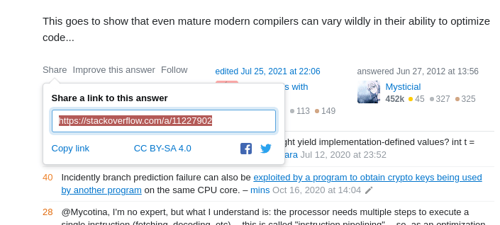
So, you just found a solution to your problem on StackOverflow. After copy-pasting that code, it’s sometimes a good thing to keep a link to the answer that helped you out so you can come back to it for future reference.

Screenshot of copying a link at StackOverflow.
// Adds handling for legacy browsers
// https://stackoverflow.com/a/XXXXXXX

This is important because solutions can change. It’s always good to know where your code came from in case it ever breaks.

Writing pull requests

Pull requests (PRs) are a fundamental aspect of any project. They sit at the heart of code reviews. And code reviews can quickly become a bottleneck in your team’s performance without good wording.

A good PR description summarizes what change is being made and why it’s being made. Large projects have a pull request template, like this one adapted from a real example:

## Proposed changes
Describe the big picture of your changes here to communicate to the maintainers why we should accept this pull request.

## Types of changes
What types of changes does your code introduce to Appium?
 - [ ] Bugfix (non-breaking change which fixes an issue)
 - [ ] New feature (non-breaking change which adds functionality)
 - ...

## Checklist
 - [ ] I have read the CONTRIBUTING doc
 - [ ] I have signed the CLA
 - [ ] Lint and unit tests pass locally with my changes

## Further comments
If this is a relatively large or complex change, kick off the discussion by explaining why you chose the solution you did and what alternatives you considered, etc…

Avoid vague PR titles

Please avoid titles that look like this:

  • Fix build.
  • Fix bug.
  • Add patch.

These don’t even attempt to describe what build, bug, or patch it is we’re dealing with. A little extra detail on what part of the build was fixed, which bug was squashed, or what patch was added can go a long way to establishing better communication and collaboration with your colleagues. It level-sets and gets folks on the same page.

PR titles are traditionally written in imperative tense. They’re a one-line summary of the entire PR, and they should describe what is being done by the PR.

Here are some good examples:

  • Support custom srcset attributes in NgOptimizedImage
  • Default image config to 75% image quality
  • Add explicit selectors for all built-in ControlValueAccessors

Avoid long PRs

A large PR means a huge description, and no one wants to review hundreds or thousands of lines of code, sometimes just to end-up dismissing the whole thing!

Instead, you could:

  • communicate with your team through Issues,
  • make a plan,
  • break down the problem into smaller pieces, or
  • work on each piece separately with its own PR.

Isn’t it much cleaner now?

Provide details in the PR body

Unlike the PR title, the body is the place for all the details, including:

  • Why is the PR being done?
  • Why is this the best approach?
  • Any shortcomings to the approach, and ideas to solve them if possible
  • The bug or ticket number, benchmark results, etc.

Reporting bugs

Bug reports are one of the most important aspects of any project. And all great projects are built on user feedback. Usually, even after countless tests, it’s the users that find most bugs. Users are also great idealists, and sometimes they have feature ideas; please listen to them!

For technical projects, all of this stuff is done by reporting issues. A well-written issue is easy for another developer to find and respond to.

For example, most big projects come with a template:

 <!-- Modified from angular-translate/angular-translate -->
 ### Subject of the issue
 Describe your issue here.

 ### Your environment
 * version of angular-translate
 * version of angular
 * which browser and its version

 ### Steps to reproduce
 Tell us how to reproduce this issue.

 ### Expected behavior
 Tell us what should happen.

 ### Actual behavior
 Tell us what happens instead.

Gather screenshots

Capture the issue using your system’s screen-shooting utility.

If it’s a screenshot of a CLI program, make sure that the text is clear. If it’s a UI program, make sure the screenshot captures the right elements and states.

You may need to capture an actual interaction to demonstrate the issue. If that’s the case, try to record GIFs using a screen-recording tool.

How to reproduce the problem

It’s much easier for programmers to solve a bug when it’s live on their computer. That’s why a good commit should come with the steps to precisely reproduce the problem.

Here’s an example:

Update: you can actually reproduce this error with objects:

 ```html
 <div *ngFor="let value of objs; let i = index">
   <input [ngModel]="objs[i].v" (ngModelChange)="setObj(i, $event)" />
 </div>
 ```

 ```js
 export class OneComponent {
   obj = {v: '0'};
   objs = [this.obj, this.obj, this.obj, this.obj];
 ​
  setObj(i: number, value: string) {
     this.objs[i] = {v: value};
  }
 }
 ```

 The bug is reproducible as long as the trackBy function returns the same value for any two entries in the array. So weird behavior can occur with any duplicate values.

Suggest a cause

You’re the one who caught the bug, so maybe you can suggest some potential causes for why it’s there. Maybe the bug only happens after you encounter a certain event, or maybe it only happens on mobile.

It also can’t hurt to explore the codebase, and maybe identify what’s causing the problem. Then, your Issue will be closed much quicker and you’re likely to be assigned to the related PR.

Communicating with clients

You may work as a solo freelancer, or perhaps you’re the lead developer on a small team. In either case, let’s say you’re responsible for interfacing with clients on a project. 

Now, the programmer stereotype is that we’re poor communicators. We’ve been known to use overly technical jargon, tell others what is and is not possible, and even get defensive when someone questions our approach.

So, how do we mitigate that stereotype? Ask clients what they want, and always listen to their feedback. Here’s how to do that.

Ask the right questions

Start by making sure that you and the client are on the same page:

  • Who is your target audience?
  • What is the goal of the site?
  • Who is your closest competitor and what are they doing right?

Asking questions is also a good way to write positively, particularly in situations when you disagree with a client’s feedback or decision. Asking questions forces that person to support their own claims rather than you attacking them by defending your own position:

  • Are you OK with that even if it comes with an additional performance cost?
  • Does moving the component help us better accomplish our objective?
  • Great, who is responsible to maintain that after launch? 
  • Do you know offhand if the contrast between those two colors passes WCAG AA standards?

Questions are a lot more innocent and promote curiosity over animosity.

Sell yourself

If you’re making a pitch to a prospective client, you’re going to need to convince them to hire you. Why should the client choose you? It’s important to specify the following:

  • Who you are
  • What you do
  • Why you’re a good fit for the job
  • Links to relevant work you’ve done

And once you get the job and need to write up a contract, remember that there’s no content more intimidating than a bunch of legalese. Even though it’s written for design projects, the Contract Killer can be a nice starting point for writing something much friendlier.

Your attention to detail could be the difference between you and another developer trying to win the same project. In my experience, clients will just as easily hire a develop they think they will enjoy working with than the one who is technically the most competent or experienced for the job.

Writing microcopy

Microcopy is the art of writing user-friendly UI messages, such as errors. I’ll bet there have been times where you as a developer had to write error messages because they were put on the backburner all the way to launch time.

That may be why we sometimes see errors like this:

Error: Unexpected input (Code 693)

Errors are the last thing that you want your users to deal with. But they do happen, and there’s nothing we can do about it. Here are some tips to improve your microcopy skills.

Avoid technical jargon

Most people don’t know what a server is, while 100% of programmers do. That’s why it’s not unusual to see uncommon terms written in an error message, like API or “timeout execution.”

Unless you’re dealing with a technical client or user base, It’s likely that most of your users didn’t take a computer science course, and don’t know how the Internet works, and why a particular thing doesn’’t work. Hence, the error.

Therefore, a good error message shouldn’t explain why something went wrong, because such explanations might require using scary technical terms. That’s why it’s very important to avoid using technical jargon.

Never blame the user

Imagine this: I’m trying to log into your platform. So I open my browser, visit your website, and enter my details. Then I’m told: “Your email/password is incorrect.”

Even though it seems dramatic to think that this message is hostile, it subconsciously makes me feel stupid. Microcopy says that it’s never okay to blame the user. Try changing your message to something less finger-pointy, like this this example adapted from Mailchimp’s login: “Sorry, that email-password combination isn’t right. We can help you recover your account.”

I’d also like to add the importance of avoiding ALL CAPS and exclamation points! Sure, they can be used to convey excitement, but in microcopy they create a sense of hostility towards the user.

Don’t overwhelm the user

Using humor in your microcopy is a good idea! It can lighten up the mood, and it’s an easy way to curb the negativity caused by even the worst errors.

But if you don’t use it perfectly, it can come across as condescending and insulting to the user. That’s just a big risk to take.

Mailchimp says it well:

[D]on’t go out of your way to make a joke — forced humor can be worse than none at all. If you’re unsure, keep a straight face.

(Emphasis mine)

Writing accessible markup

We could easily spend an entire article about accessibility and how it relates to technical writing. Heck, accessibility is often included in content style guides, including those for Microsoft and Mailchimp.

You’re a developer and probably already know so much about accessibility. You may even be one of the more diligent developers that makes accessibility a core part of your workflow. Still, it’s incredible how often accessibility considerations are put on the back burner, no matter how important we all know it is to make accessible online experiences that are inclusive of all abilities.

So, if you find yourself implementing someone else’s copywriting into your code, writing documentation for other developers, or even writing UI copy yourself, be mindful of some fundamental accessibility best practices, as they round out all the other advice for technical writing.

Things like:

Andy Bell offers some relatively small things you can do to make content more accessible, and it’s worth your time checking them out. And, just for kicks, John Rhea shows off some neat editing tricks that are possible when we’re working with semantic HTML elements.

Conclusion

Those were six ways that demonstrate how technical writing and development coincide. While the examples and advice may not be rocket science, I hope that you found them useful, whether it’s collaborating with other developers, maintaining your own work, having to write your own copy in a pinch, or even drafting a project proposal, among other things.

The bottom line: sharpening your writing skills and putting a little extra effort into your writing can actually make you a better developer.

Technical writing resources

If you’re interested in technical writing:

If you’re interested in copywriting:

If you’re interested in microcopy:

If you’re interested in using a professional style guide to improve your writing:

If you’re interested in writing for accessibility:


Technical Writing for Developers originally published on CSS-Tricks. You should get the newsletter.


source https://css-tricks.com/technical-writing-for-developers/